
Foodhak: Redesigning a D2C Personalised Nutrition AI App
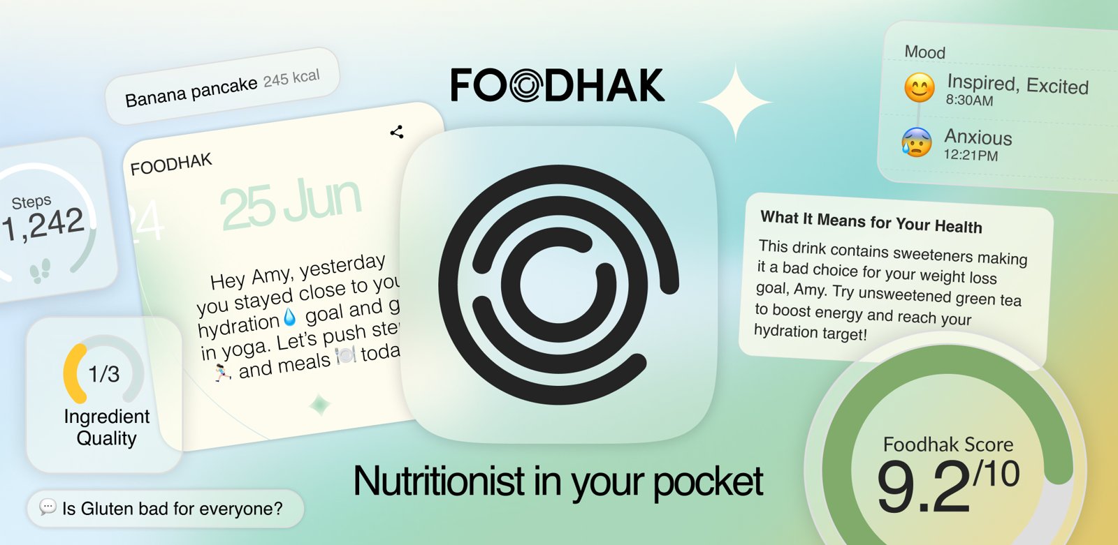
The AI underneath Foodhak was brilliant and deeply personal, but its intelligence sat buried across five siloed tools, and nothing pulled you back to feed it.
This case study covers rebuilding those five tools around that intelligence as one coach, Faye, the states designed for AI uncertainty, and the daily loop that keeps users feeding it, because the AI only gets smarter the more you use it.
- Role
- Product designer
- Scope
- UX/UI design, Product strategy, interaction design, UX writing, design system, prototyping
- Scale
- 150K+ downloads · ~37K monthly actives (UK + global)
- Time
- May 2025 – Jan 2026
- Location
- London
- Team
- 1 PM, 2 Engineers, 1 Front-End Dev, 2 Product Designers (Self)


Raise your hand if…
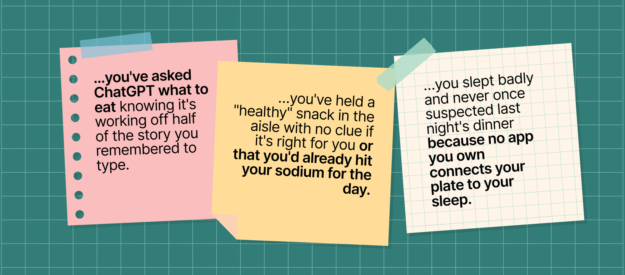
Foodhak was built to end all of it. A clinical-grade AI trained on millions of research papers, getting sharper every time you feed it. Not a scanner, a logger and a chatbot bolted together; one intelligence that sees your whole day at once, and tells you what it means.
One app that actually knows your body, allergies, conditions and goals, and reads your food, sleep, steps and bloods together, so it tells you not just what’s in something, but what it means for you, today.
It didn’t just track you. It knew you.
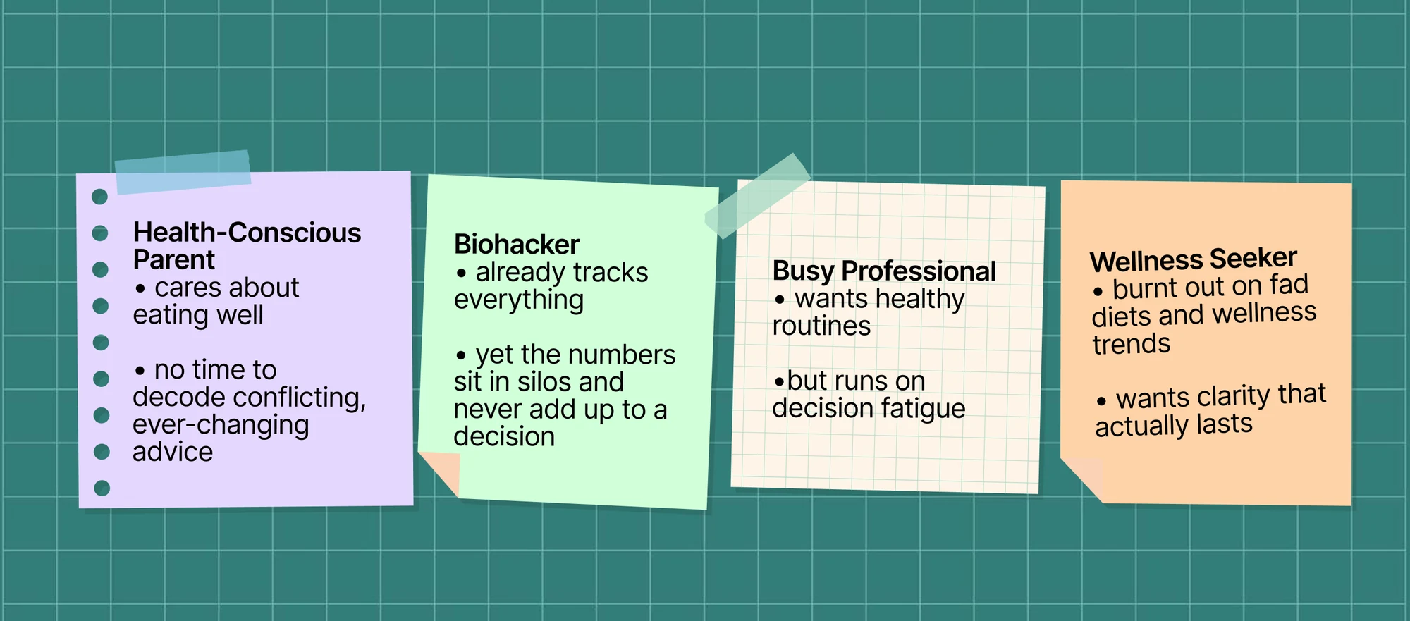
Who it’s for
Why the redesign was needed
What Foodhak could already do
A patent-pending engine turns 2M+ scientific papers into validated insights through a “clinical triplet” system (e.g. Kiwi → serotonin boost → better sleep latency), storing context like age, dosage and lifestyle. Every chat, scan, meal plan and recipe references that same evidence layer, so guidance is personalised and clinically grounded.
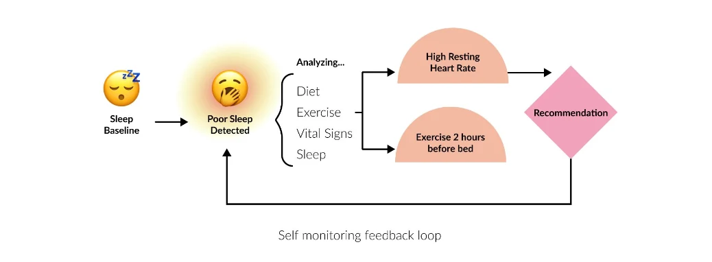
On paper, it was already everything it promised:
The technology continually analysed your meals, movement, sleep and habits, cross-referencing thousands of peer-reviewed studies to understand what your body truly needs, optimising your nutrition in real time. Science, intelligence and personalisation, working seamlessly together. BUT..
That promise wasn’t translating
Open the old Foodhak and you didn’t meet a coach, you met a drawer of smart tools. An AI assistant, a food scanner, a meal log, a recipe builder, and health & goal tracking: five genuinely clever features, each already personalised to you, each in its own separate tab, none of them talking to each other.
The science, intelligence and personalisation was all there. You just couldn’t feel it.
The home was already a feed, with a message for you, ingredients that are good for you, and more. But it was passive. It showed you things and asked nothing back, so it never pushed you to log or engage, and the AI never got more personal.
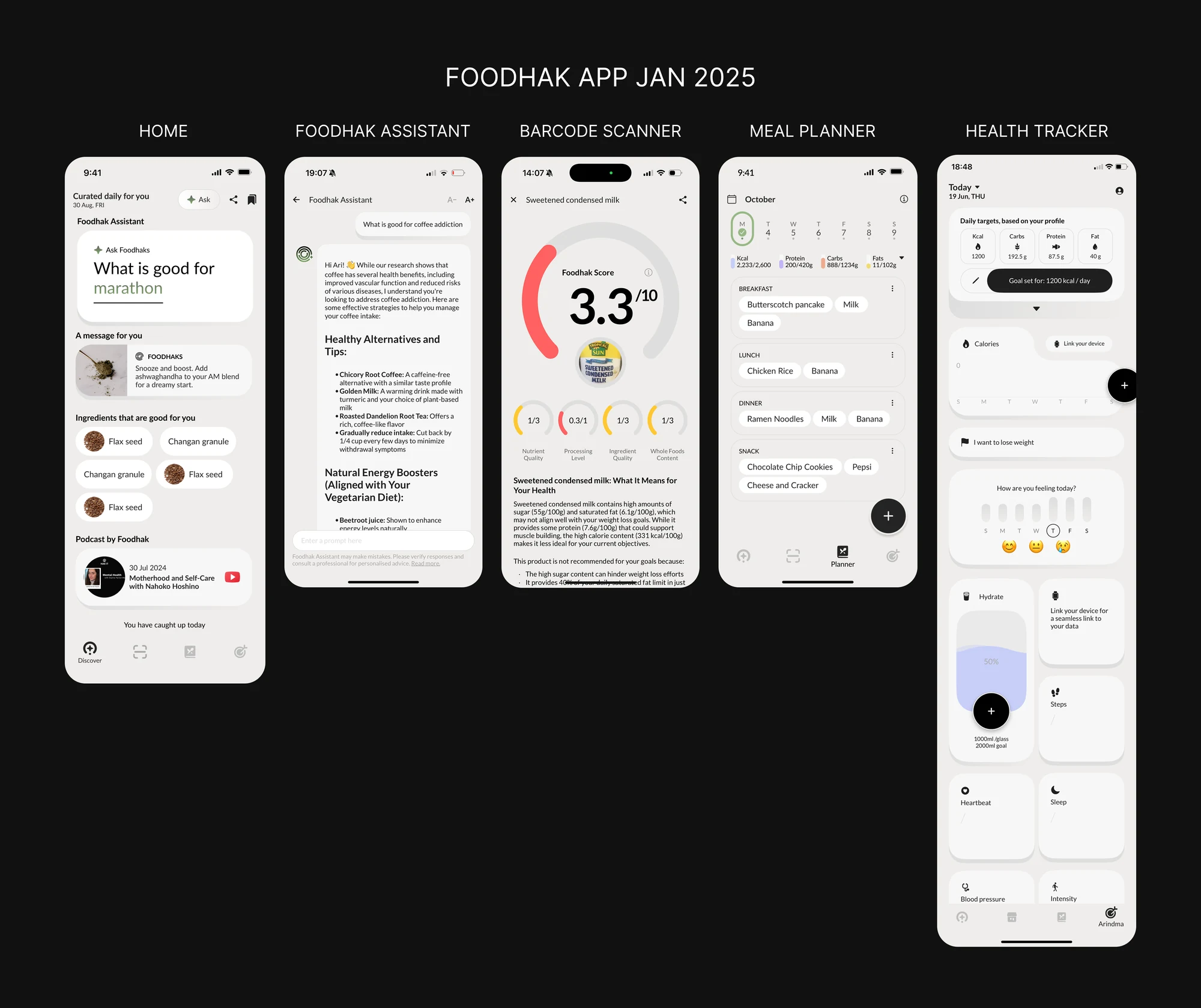
How do you make five personalised tools feel like one coach?
The solution: unify the toolbox into a voice, Faye.
The lazy fix was to redesign all five tools. The real one was to stop treating the AI as one of them, and make it the spine of the whole product. That meant a series of deliberate calls.
Decision 1: Personify the intelligence
“Foodhak Assistant” is a chatbot feature you operate and the intelligence personified is someone you come back to. In a small startup the naming was a shared effort: founder, PM and marketing all weighed in, against criteria we’d agreed: memorable, 2–3 syllables, unique, evoking food + intelligence + longevity. We landed on Faye.
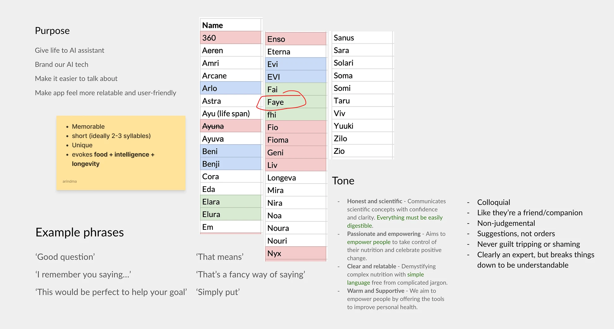
Decision 2: A face for the intelligence
Options I weighed: how to give Faye a mark for an AI that unfolds insight from your patterns. I looked at how other AI products mark themselves (the Gemini spark, Claude, Perplexity, ChatGPT), and explored richer constructions: a Solomon’s knot (wisdom, continuity, interconnectedness), a golden-ratio Fibonacci spiral (organic order, balance), a soft swirling mark, and an ✦ + F lockup.
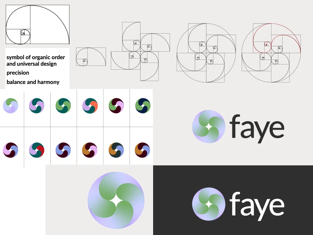
Why this did not work
The ornate marks were saying too much for something that should feel calm and instant.
My first instinct was a floating, omnipresent Faye, hovering over every screen and ready to answer anything. But a helper that follows you everywhere didn’t solve the real problem: it just stacked a sixth thing on top of the five instead of unifying them. So I dropped it, and the real question surfaced.
Decision 3: Where should Faye live?
Not hovering on top of the app, but inside it.
A chatbot waits for you; a coach speaks first.
The trouble with a floating faye is that most people don’t know what to ask a nutrition AI, so they ask nothing and the intelligence stays invisible. So I moved it onto the home and had Faye open the conversation.
Several iterations surfaced insights on the home in different shapes (dashboards, mood trackers, highlight reels, card stacks) before converging.
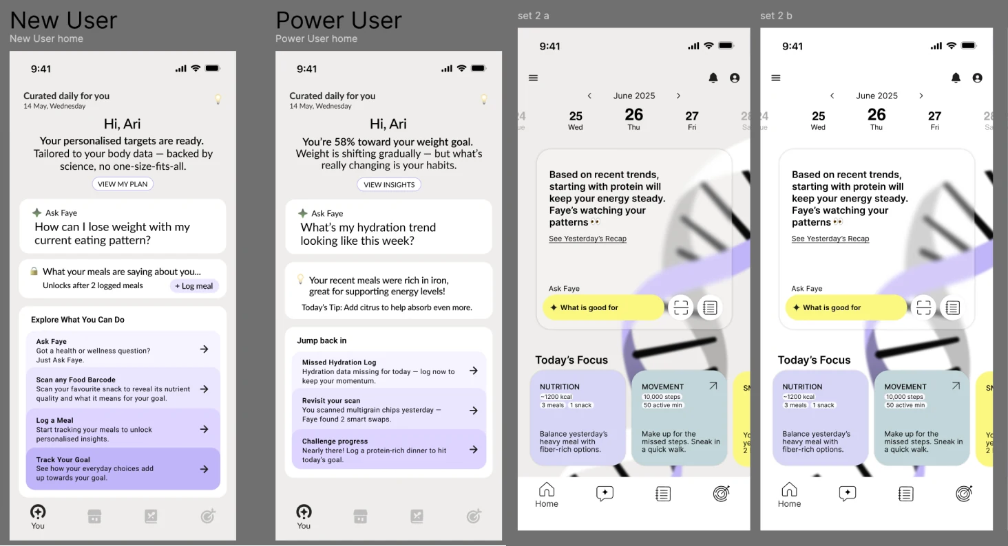
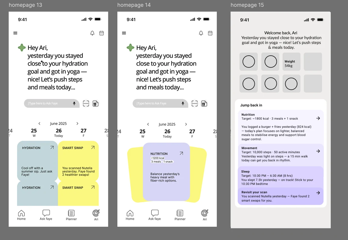
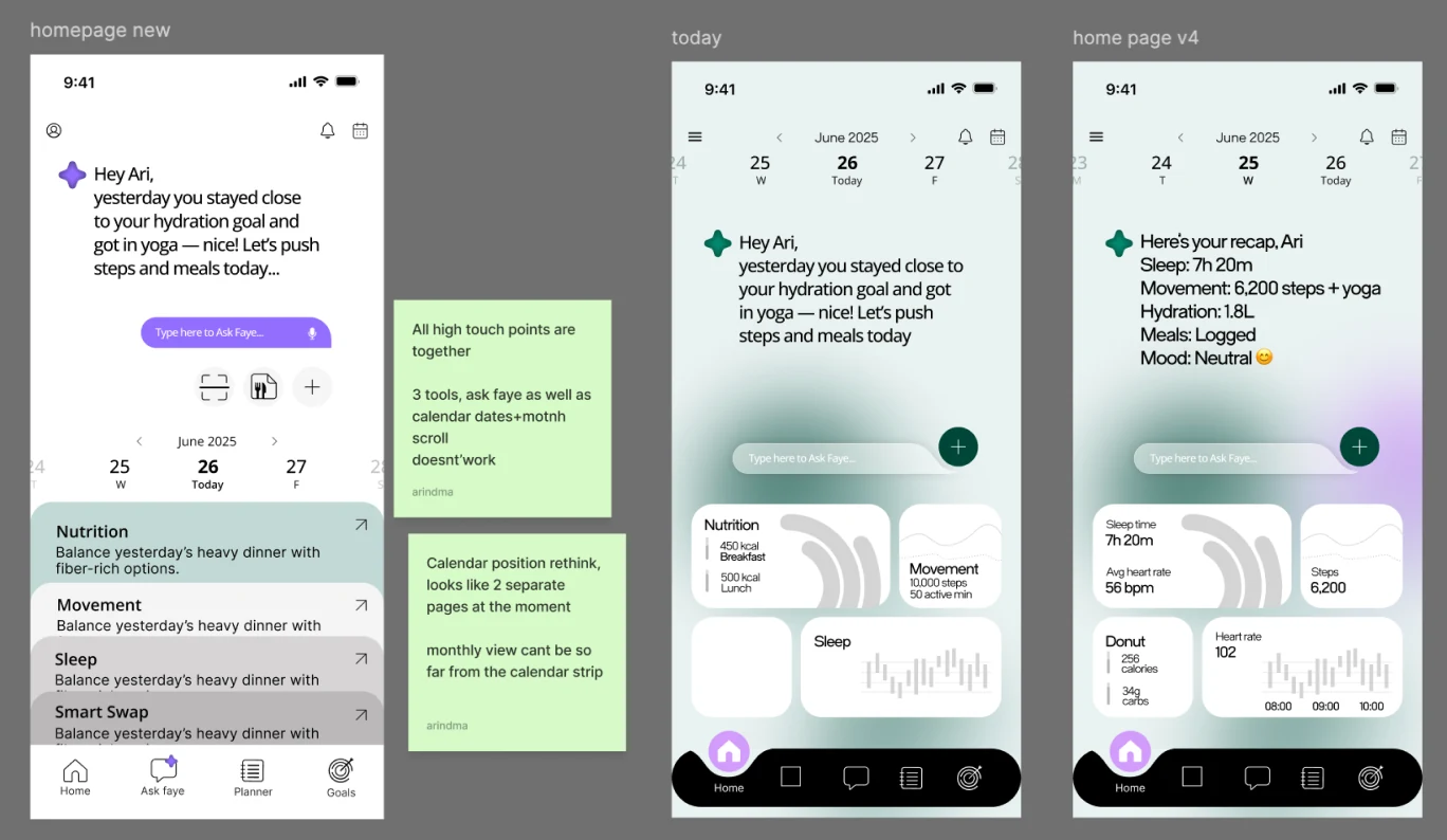
These iterations didn’t work, but they led us to the final version of the homepage.
I dropped the swirl entirely and went clean: a simple 4-point spark beside a lowercase “faye” wordmark, the version that ships in the intro “Hey, I’m Faye”.

Decision 4: The home as a rhythm of yesterday/today/tomorrow
Options weighed: a dense dashboard of everything you could be failing, or a simple narrative a coach would actually use.
The decision: a rhythm of yesterday (how it went), today (what to do) and tomorrow (what’s coming). Buried numbers became a story only Faye could tell: “last night’s late sugar likely cost you deep sleep, let’s eat earlier today.”
The final look: it all came together in a soft glass UI over a calm pastel palette: translucent, airy and reassuring.
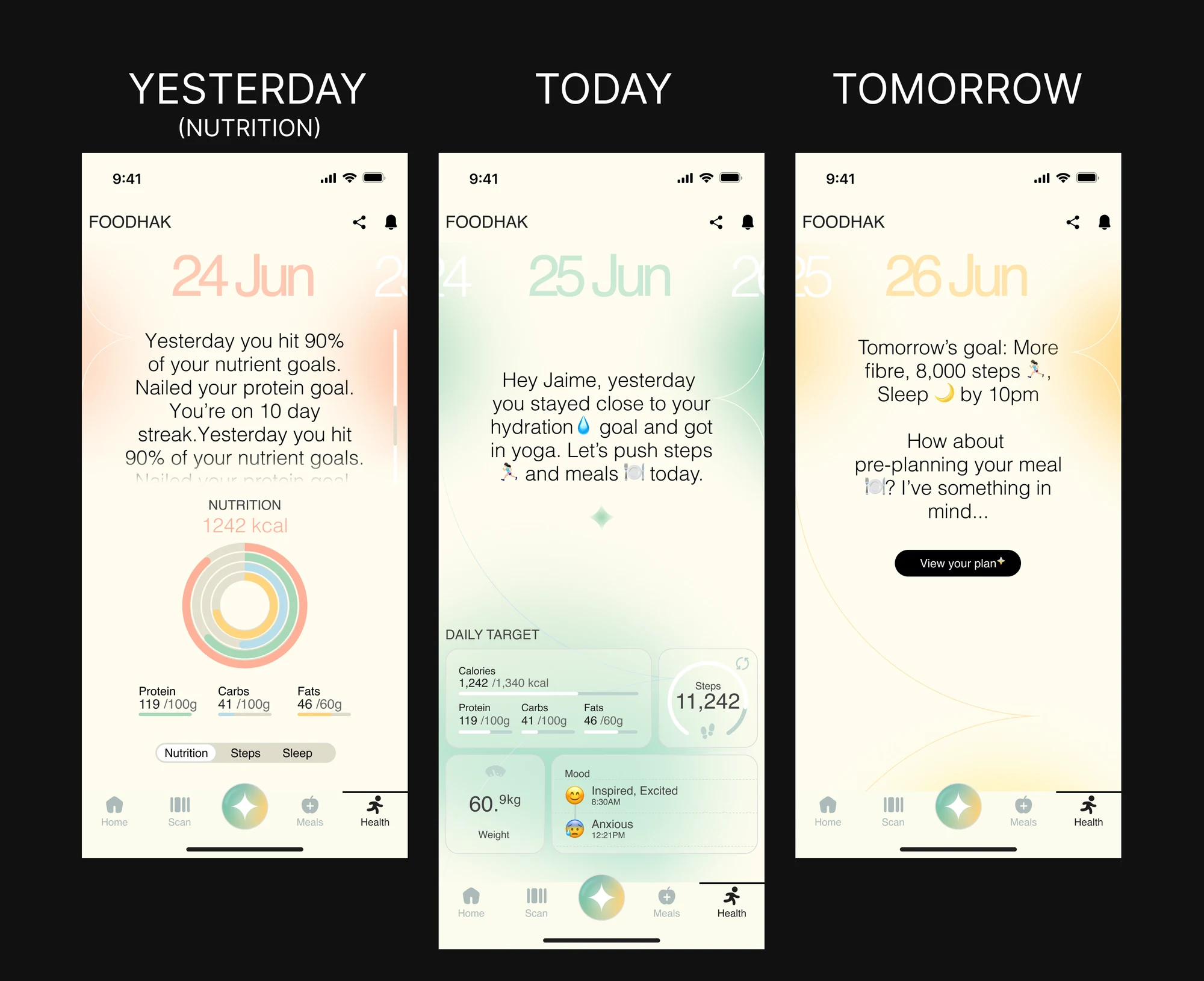
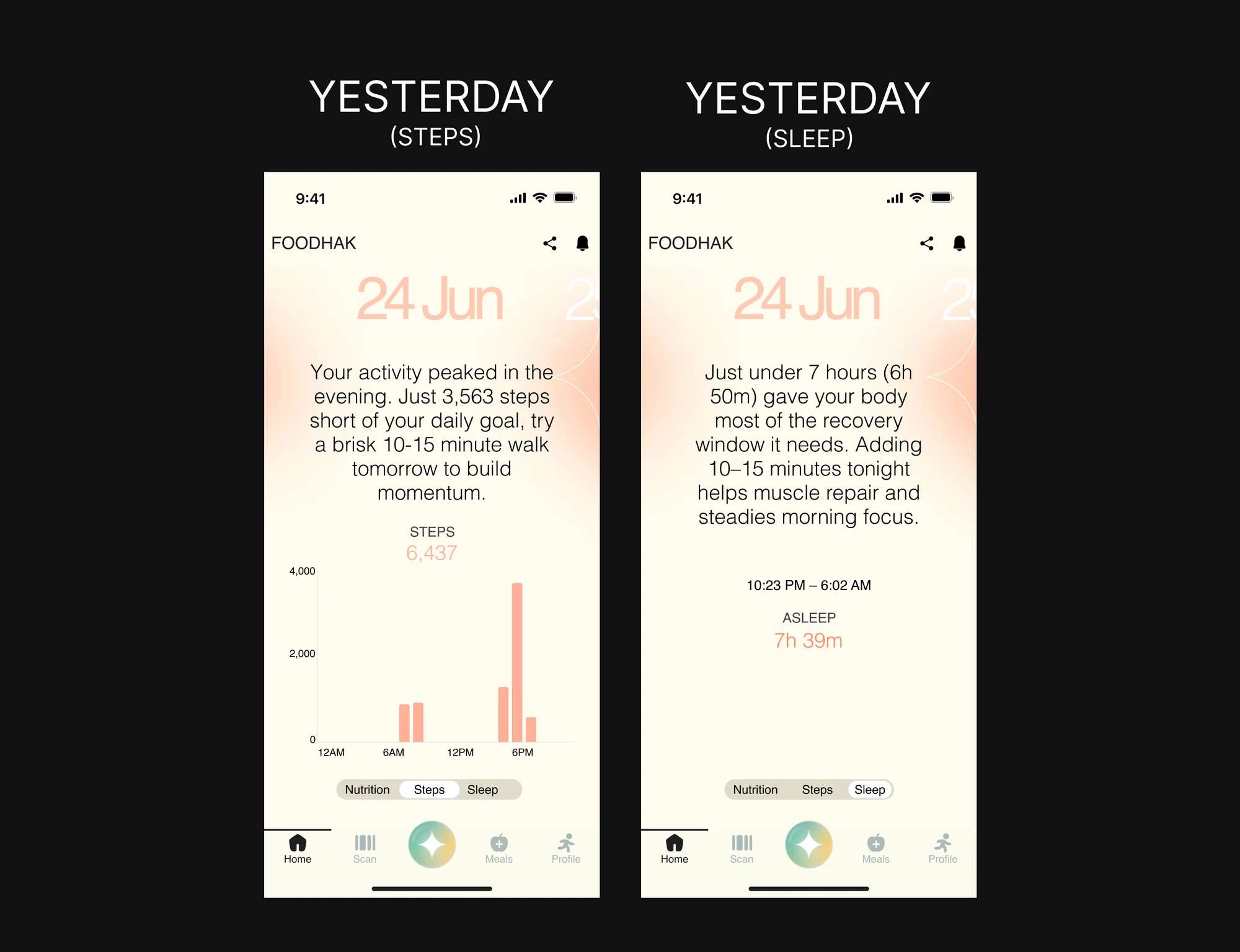
The result: the app stopped being a drawer of tools you operate, and became one coach that meets you where you are.
Designing states for AI uncertainty
How do you make unpredictable AI behaviour feel understandable and recoverable?
An AI that gets it right is easy to demo. Trust is decided by everything else: when it doesn’t have the data, when it’s slow, when it has nothing to show, and when it’s about to write to someone’s health record. In a health app, how Faye says it decides whether someone trusts her or ignores her. For most of these states, the design was the copy. Where words alone weren’t enough, I designed the screen around them.
1. Uncertainty: when Faye doesn’t know yet
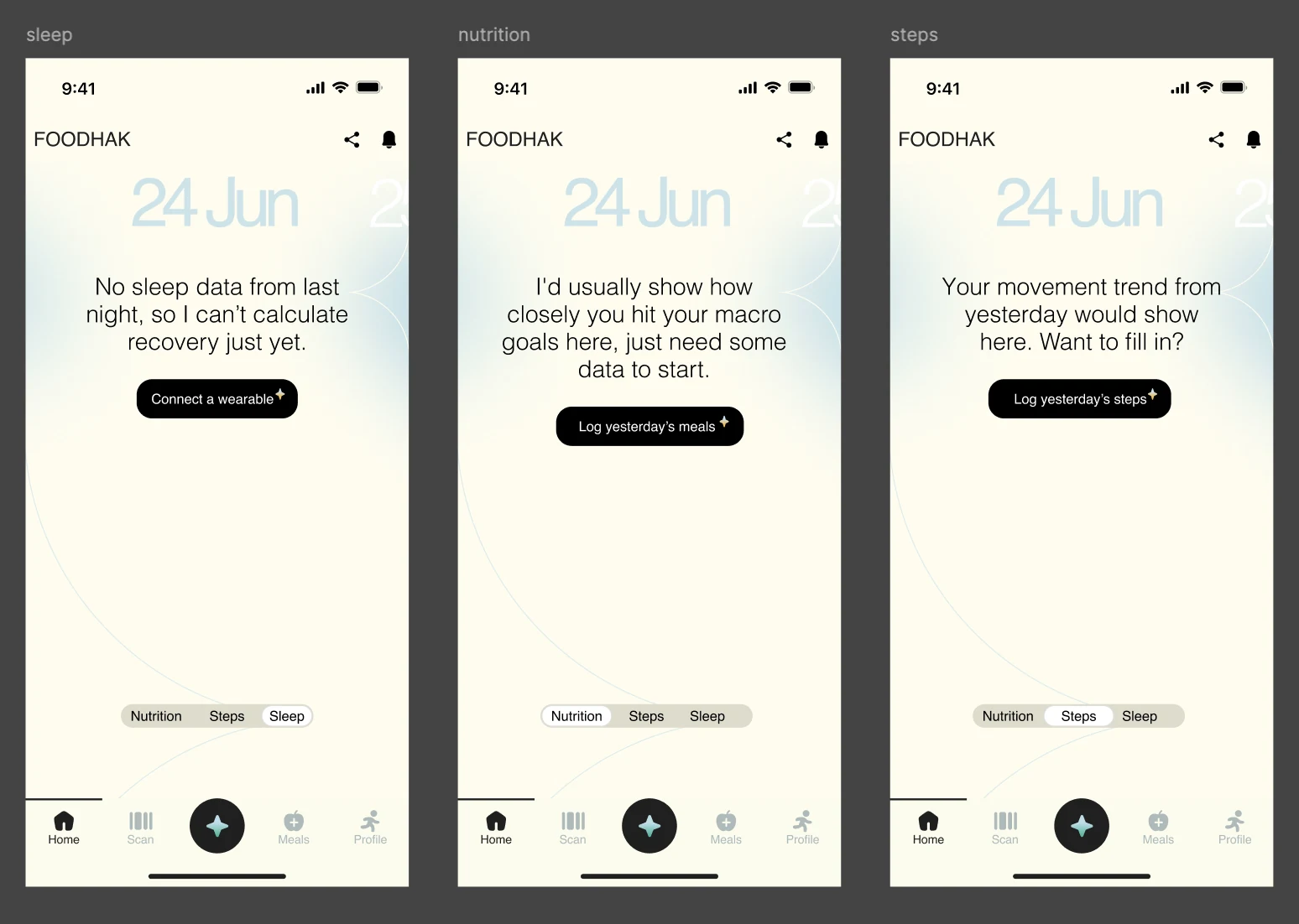
The home looks back at yesterday, but only if there is something to read. When someone didn’t log, an empty chart would say nothing. Faye says what she can’t do and why, in the first person.
- Sleep: “No sleep data from last night, so I can’t calculate recovery just yet.”
- Nutrition: “I’d usually show how closely you hit your macro goals here, just need some data to start.”
- Steps: “Your movement trend from yesterday would show here. Want to fill in?”
Nothing is guessed or faked. She says what she knows (there’s no data), what she can’t tell you yet (the result), and gives one button to close the gap: Connect a wearable, Log yesterday’s meals, Log yesterday’s steps. The missing data becomes the next log.
2. Latency (waiting): while Faye is working
Insights take a moment to come together, and a blank screen reads as broken. So the wait has a voice: a looping spark and one line, “Your insights are coming together. Check back here shortly.” It tells the user she’s working, and that it’s fine to leave.
If it runs long, the copy changes so the wait never goes silent: “Taking a little longer than usual. Come back here shortly.”
3. Failed recommendation: when nothing comes back
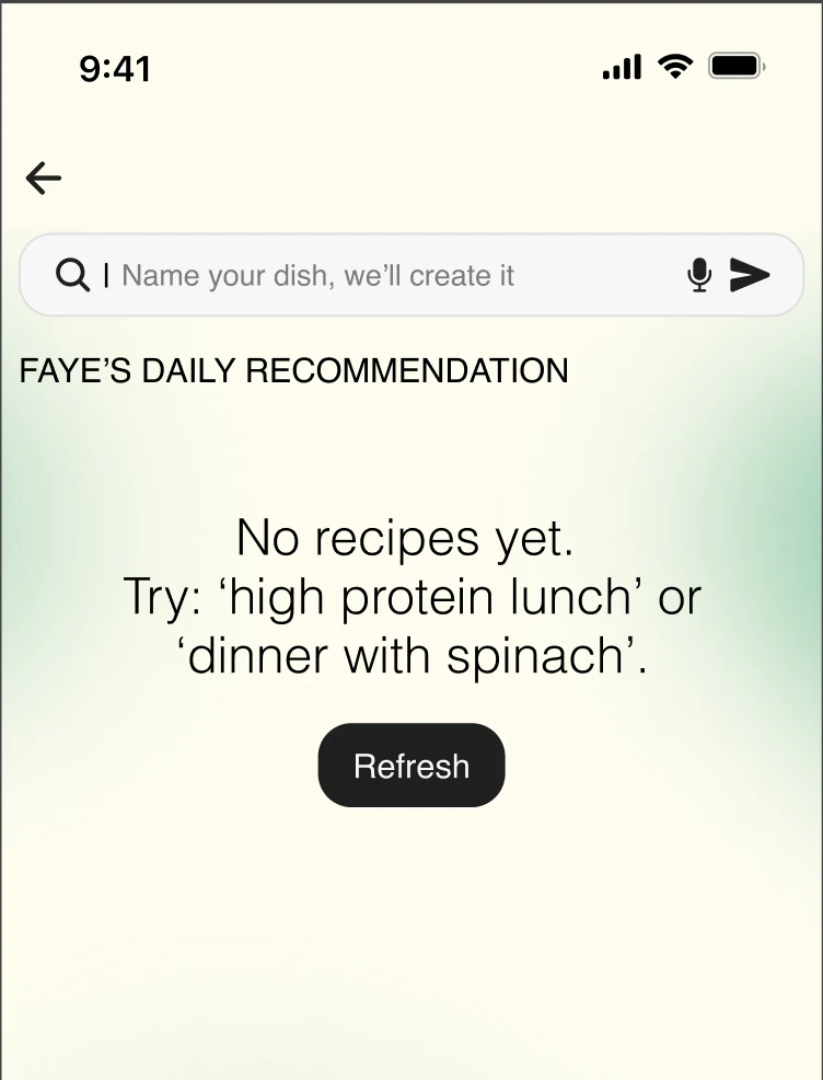
Faye’s daily recipe recommendation won’t always come through. The page says where things stand and what to do next: “No recipes yet. Try: ‘high protein lunch’ or ‘dinner with spinach’.”
Two ways forward, no dead end: give Faye a prompt that works, or tap Refresh. The search bar above keeps inviting a dish name, so the user can carry on either way.
4. User confirmation: before anything is saved
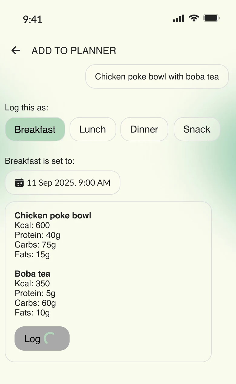
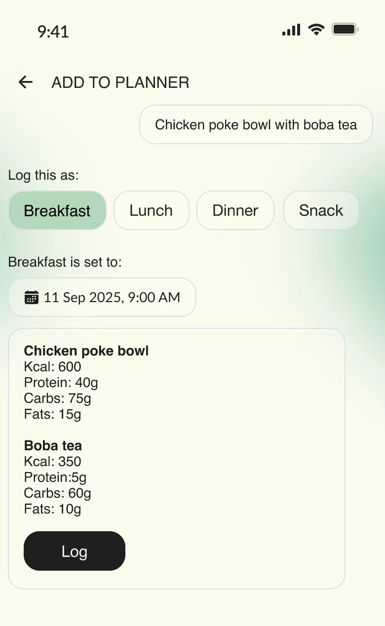
When someone types a dish like “Chicken poke bowl with boba tea”, Faye works out the macros for each item from the name alone. That’s an estimate, and an estimate shouldn’t go straight into a health record.
While she calculates, the Log button is muted with a small spinner, so there’s nothing to save until the numbers exist. Once they’re in, every item is broken down (kcal, protein, carbs, fats), the meal type is one tap (Breakfast, Lunch, Dinner, Snack), and the time is visible and editable: “Breakfast is set to: 11 Sep 2025, 9:00 AM”. Nothing is saved until they tap Log.
Faye proposes and the user decides. She can be roughly right and it doesn’t matter, because the user always has the last word on their own record.
When Faye fails, the user still knows what happened and always has a way back.
How do you give users a reason to open it every day? (retention + engagement)
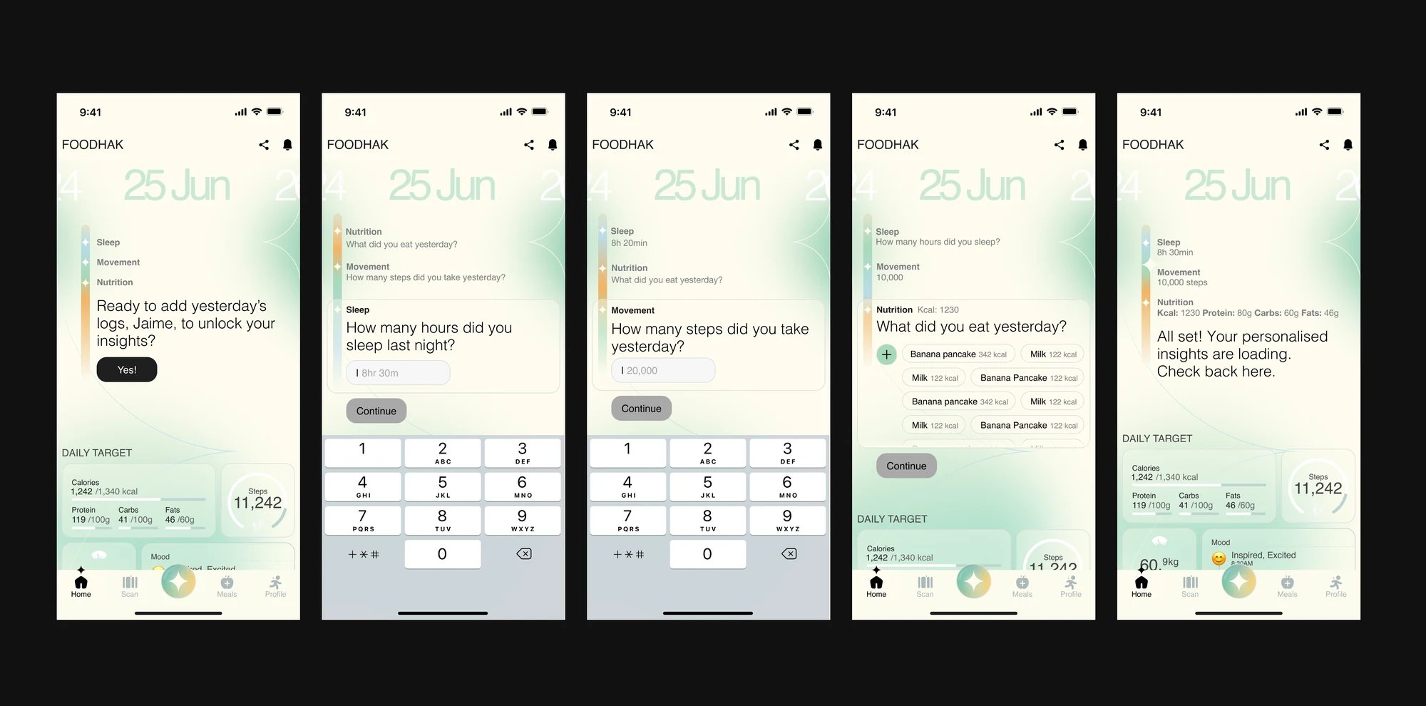
The logging-to-unlock insight loop
A coach is only as good as what it knows about your day. The insight genuinely can’t exist without the logs, and Faye gets smarter the more you feed her.
It’s a real habit loop: trigger (you want the insight) → action (log) → reward (the insight) → investment (your data sharpens tomorrow’s coaching).
Open Foodhak for your insights and Faye stops you first: “Ready to add yesterday’s logs to unlock your insights?” For a second, that’s friction. It’s also the most deliberate decision in the app.
Recipes follow the same rule. Personalised recipes unlock once you've logged, so the logging habit feeds every part of the app.
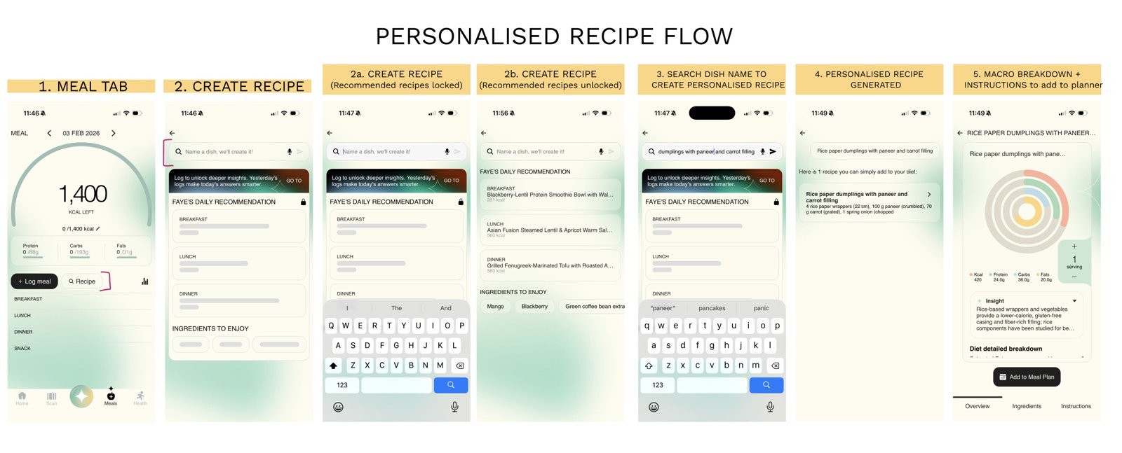
Three decisions reduced the friction:
- One tap at a time: never a form
- A visible progress trail: you always see the finish line
- Faye asks, instead of demanding
One gate, three wins: less wasted AI cost, better insights, a real daily habit.
~37% → ~50%: day-to-day returning users, after shipping (Oct 2025)
~5% → ~7%: daily stickiness
Core features
With the direction set, every core feature was rebuilt to match, improved in both UX and UI, so the five tools finally looked and behaved like one coherent coach rather than five separate apps.
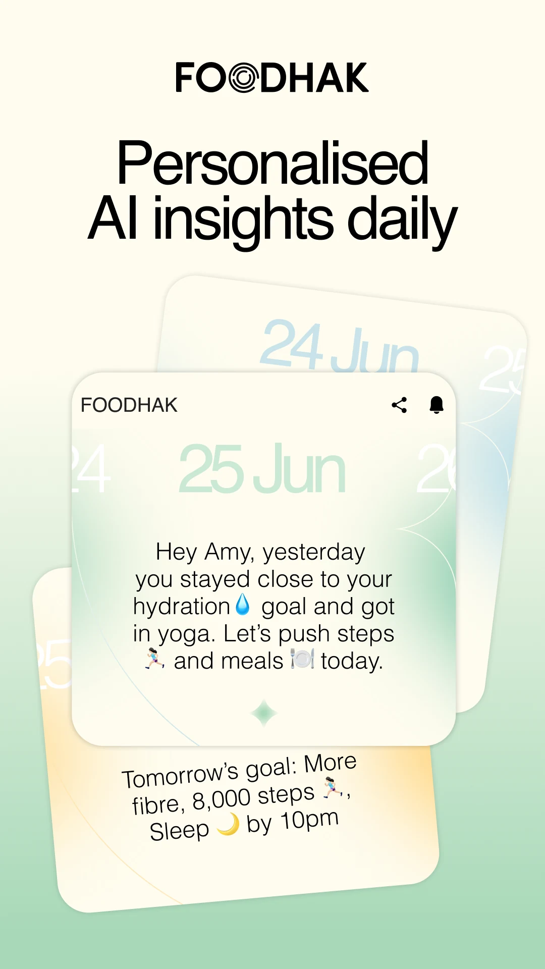
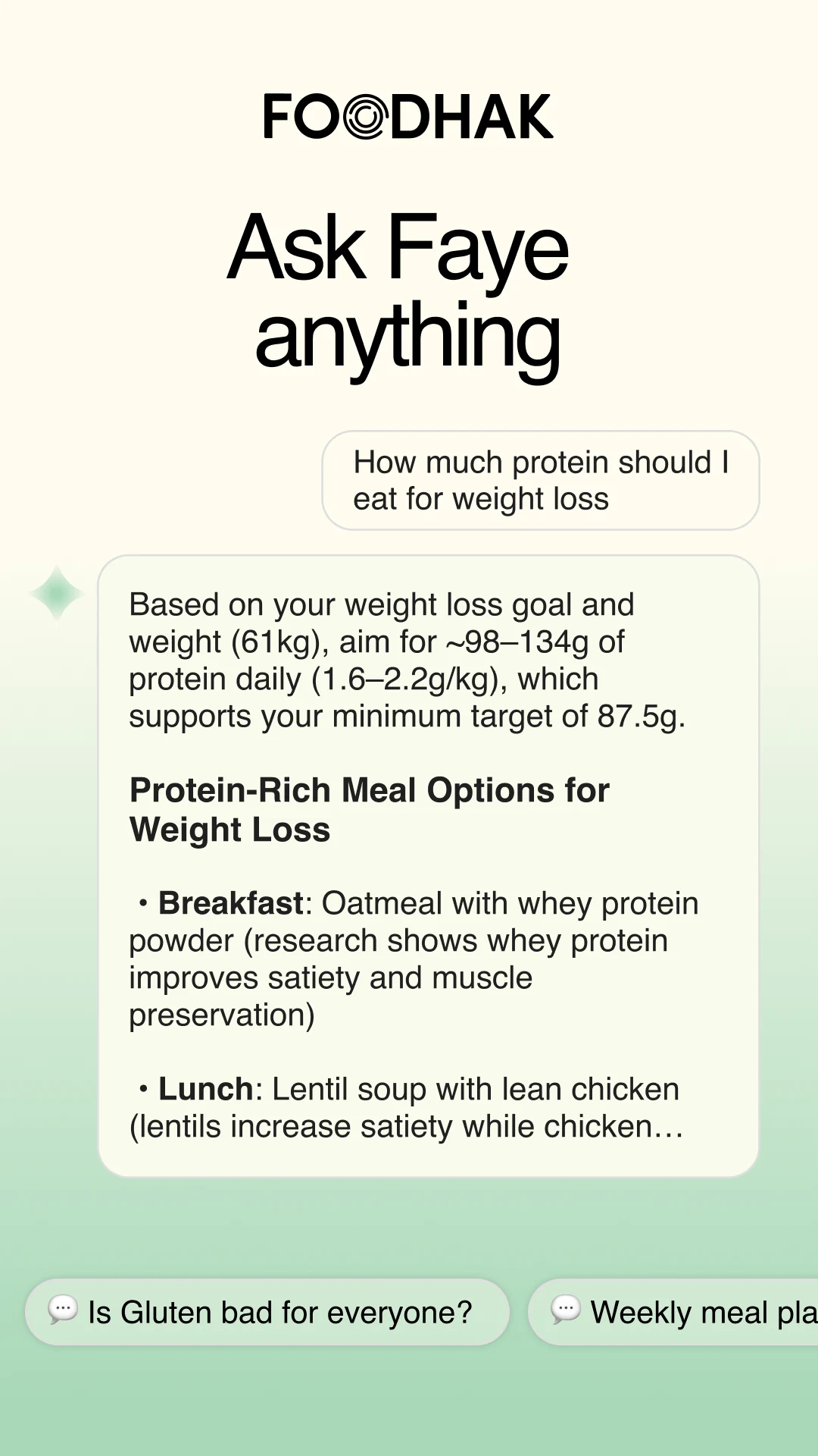
- Meet Faye, your AI health coach: ask her anything, and she connects food, movement and sleep into one meaningful read.
- Insights that evolve with you: the more you log, the sharper the daily picture.
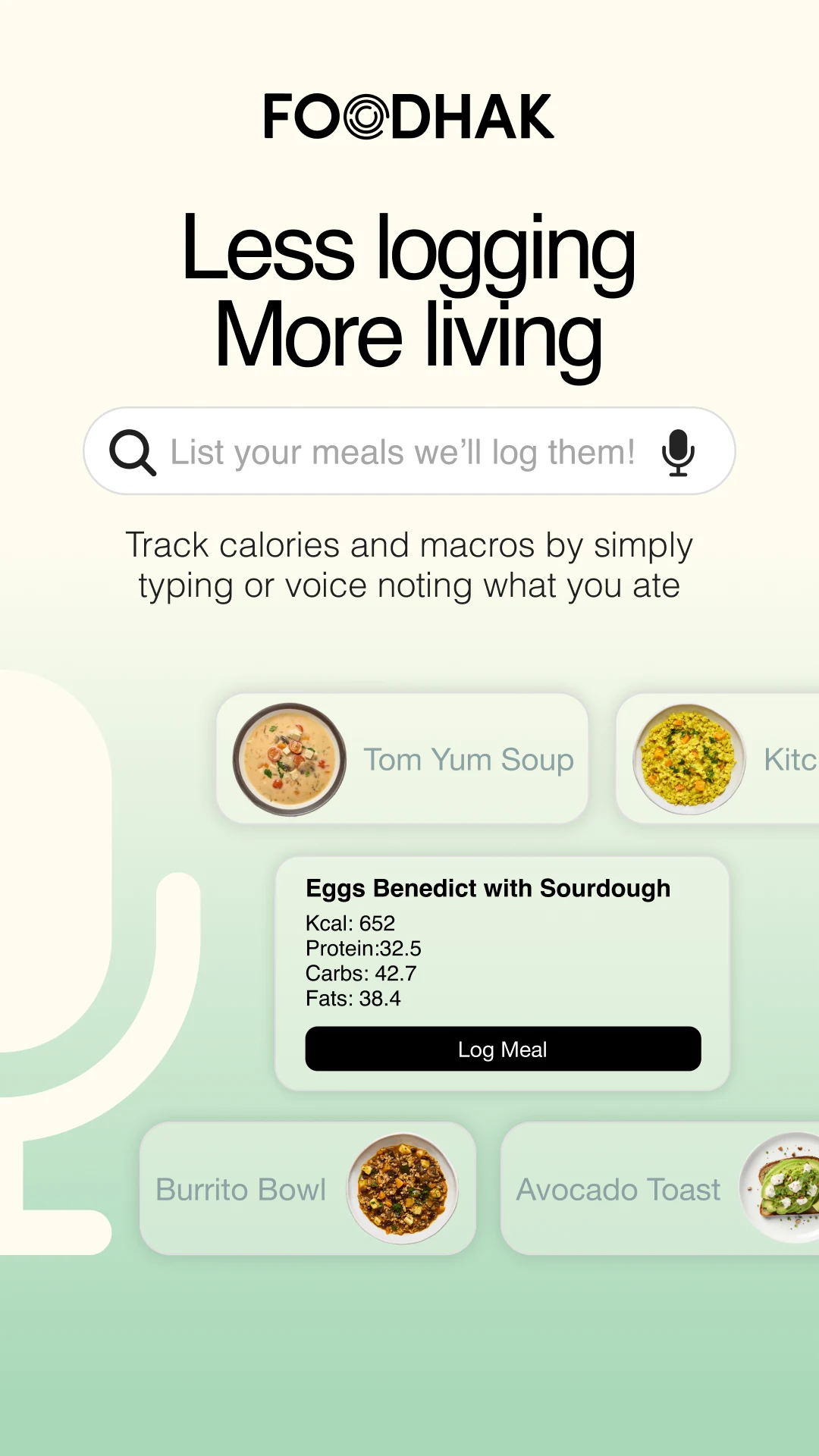
- Smarter meal planning: balanced, goal-aligned meals suggested by Faye, logged by typing or voice.
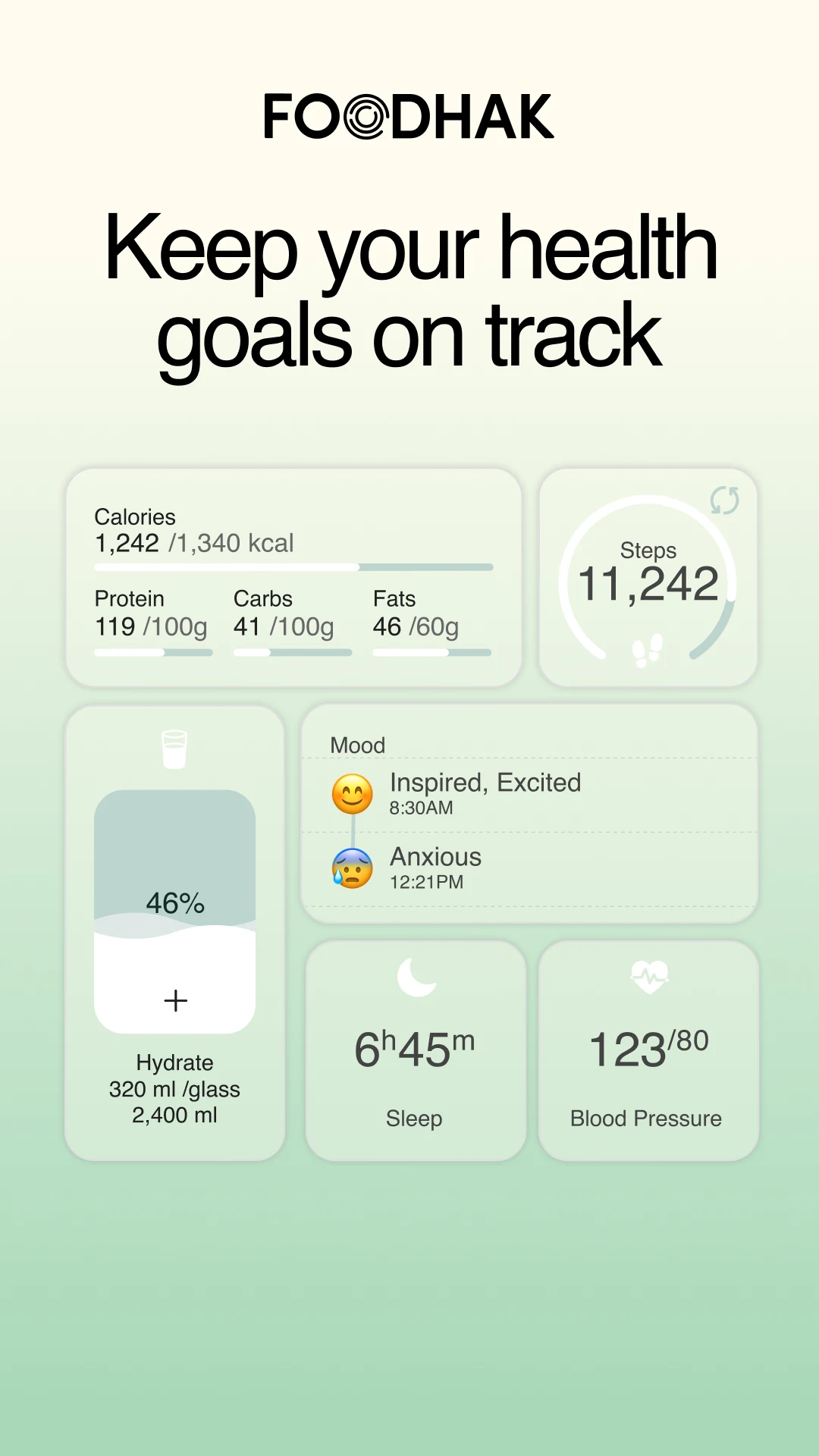
- Smarter tracking for every goal: steps, sleep, macros and meals in one place.
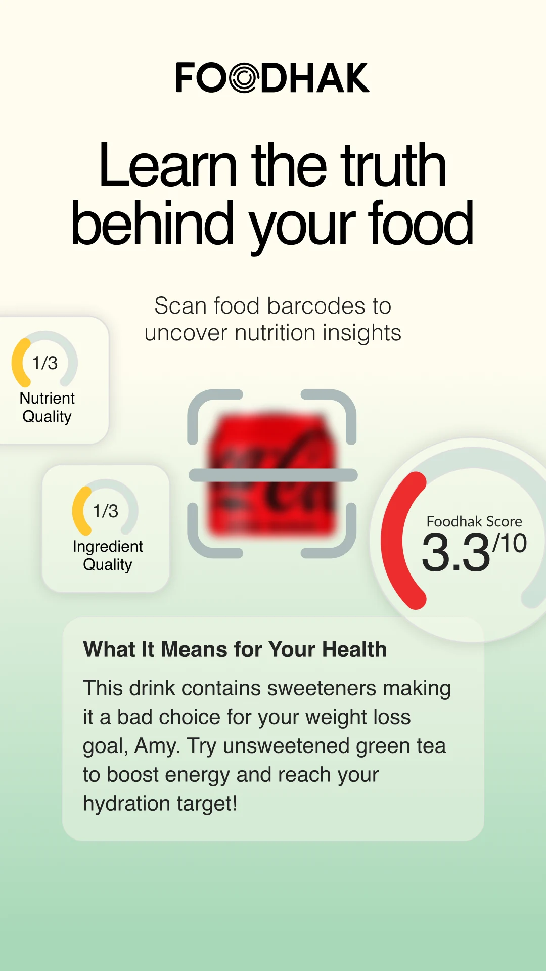
- Know what’s in your food: a barcode scan surfaces ingredients, nutrient quality and a Foodhak Score, and what it means for you.
Impact
150K+ global downloads · 45K in the UK
DAU/MAU ~6%
~37K monthly actives · 8K WAUs
Global presence: UK, UAE, USA, Kuwait, India, Malaysia, Indonesia
Challenges
- Every AI insight costs money. The intelligence is a paid call each time it thinks, so engagement and cost were the same problem, and part of why the loop had to earn its keep.
- Prioritisation. The intelligence was already strong and ideas were never the problem. Convergence was. With a tiny team, the hard calls were which ideas to kill and which features the team could realistically build, support and scale.
What I took from it
Scaling a product inside a small startup team was a bootcamp in itself. I wasn’t handed one neat problem. I got the whole surface area and learnt it by shipping: product strategy and prioritisation, designing AI-powered products and features, behavioural and habit design, a retention loop, monetisation and pricing, and a design system.
Monetisation and pricing have their own case study: Monetising a free AI app without selling personalisation.
Fun bits
Watch us spot our app ad across central London