
Monetising a free AI app without selling personalisation
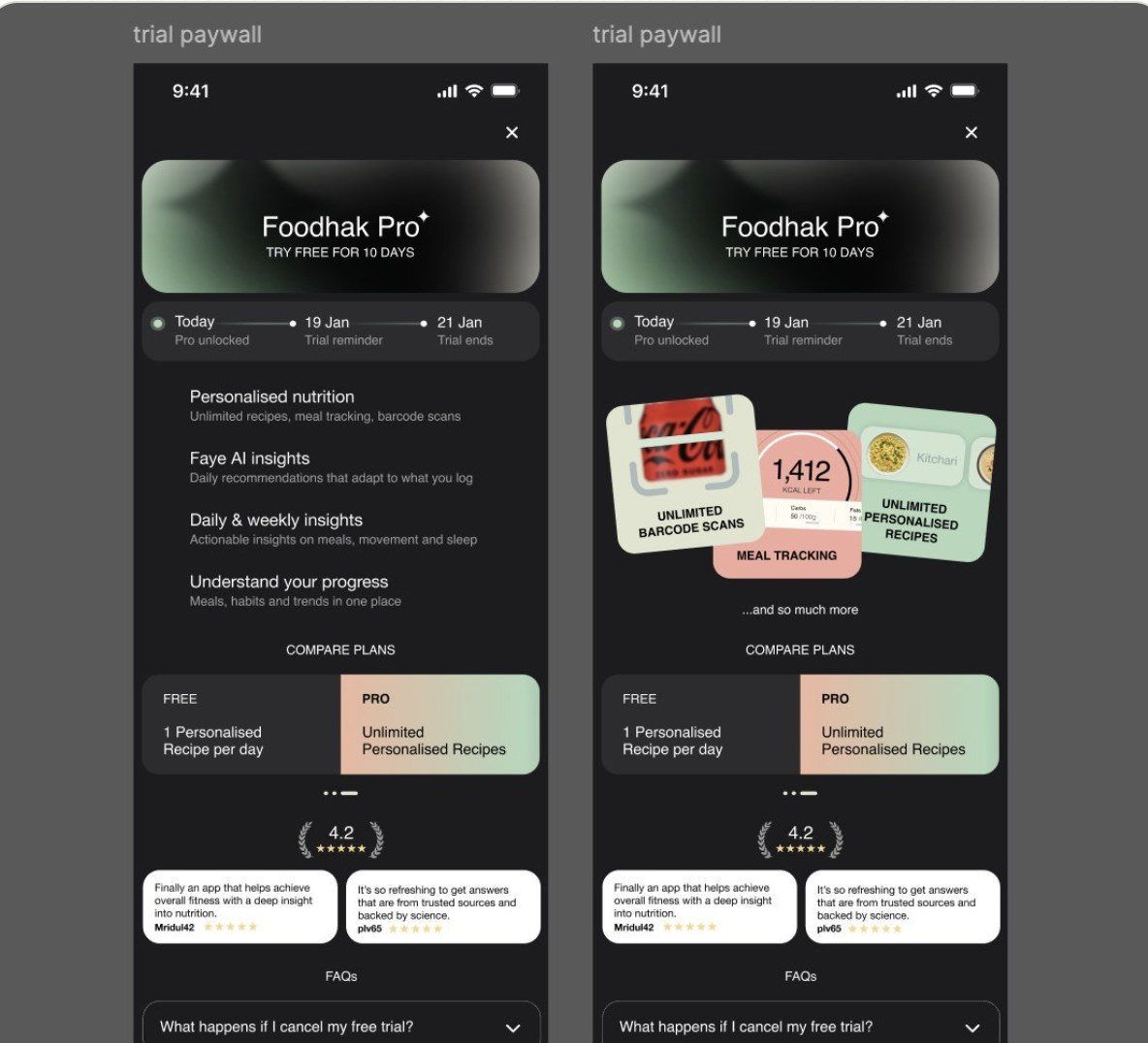
Foodhak app, 10 day trial. I defined a Free and Pro split and the weekly summary that anchors Pro.
This case study covers the Free and Pro split, the trial and its lifecycle, where the paywalls appear and how they feel, and the weekly summary that anchors Pro.
- Role
- Sole Product designer
- Scope
- UX/UI design, product strategy, market benchmarking, UX writing
- Time
- Nov 2025 to Jan 2026
- Location
- London
- Team
- PM and 3 engineers
A Free and Pro split that never gates personalisation
About Foodhak App
Foodhak is a nutrition app built around an AI that knows you. Your profile holds your body, allergies, conditions and goals, and the app reads your food, sleep, steps and bloods against it. Behind that sits an evidence engine built on over 2 million scientific papers. It turns research into insights tied to your context, such as age, dose and lifestyle, so each insight says why it applies to you.
Personalisation runs through every screen. A scan returns a Foodhak score and says what that food means for your goal. Recipes are built around your goals, Faye can answer from your own data, and the weekly summary turns a week of logging into patterns. The app gets sharper the more you use it.
That shaped the monetisation. Personalisation stays on every screen, and Pro sets how much you can use it and how deep it goes. The full picture of the app, and how its five tools were rebuilt into one coach, is in the redesign and retention case study ↗.
The cost of a free AI app
A free AI app gets more expensive the more people use it. Every answer from Faye, every scan and every recipe has a cost, so the free version can't stay free forever.
The first decision was a principle: personal is the product, so we don't sell it. Everything about how the app knows you stays in the free experience. Pro sells depth, control and a clearer view of your own patterns.
Problem(s)
How does a free app make money when its AI costs money every time it thinks?
The answer had to cover the cost of the AI without breaking trust. Free needed to be useful enough to build a habit. Pro needed to feel like an upgrade.
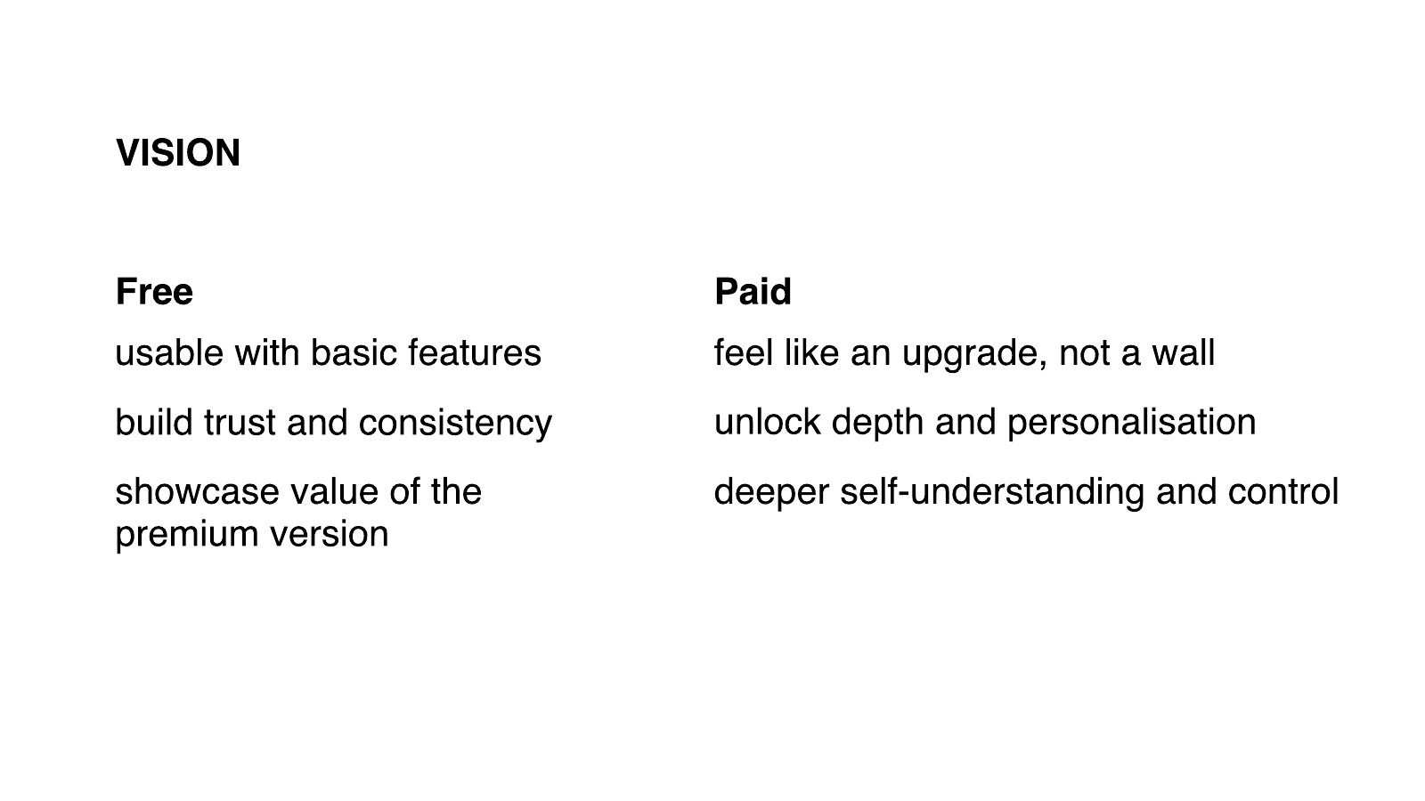
I wrote the split down as a vision for the team:
- Free is usable with basic features, builds trust and consistency, and shows the value of the premium version.
- Paid feels like an upgrade. It unlocks depth and personalisation, and gives people deeper self-understanding and control.
Two principles came out of that, and they shaped everything after:
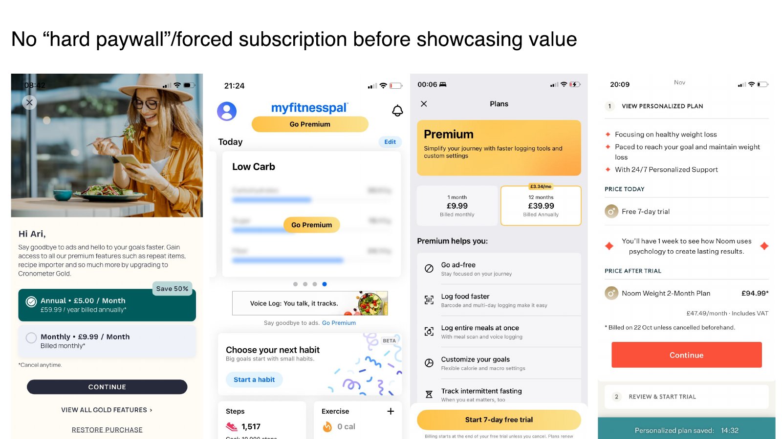
- No hard paywall before the app has shown its value. A forced subscription on day one would ask people to pay for something they'd never used.
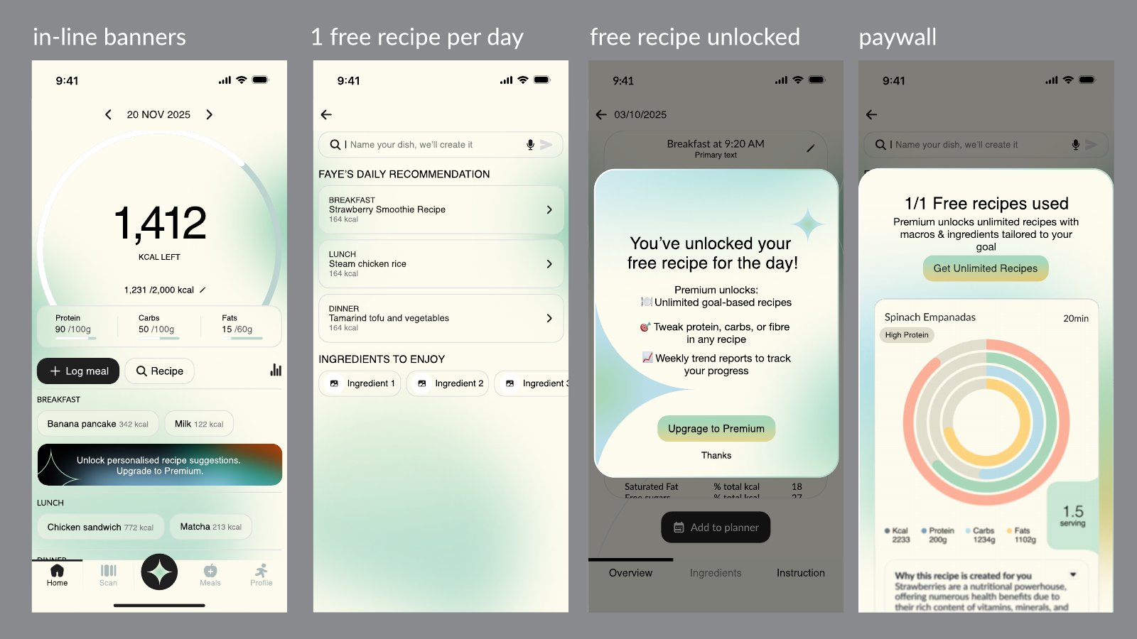
- The paywall sits inside the user's journey, at the moment it's relevant, in a way that feels natural.
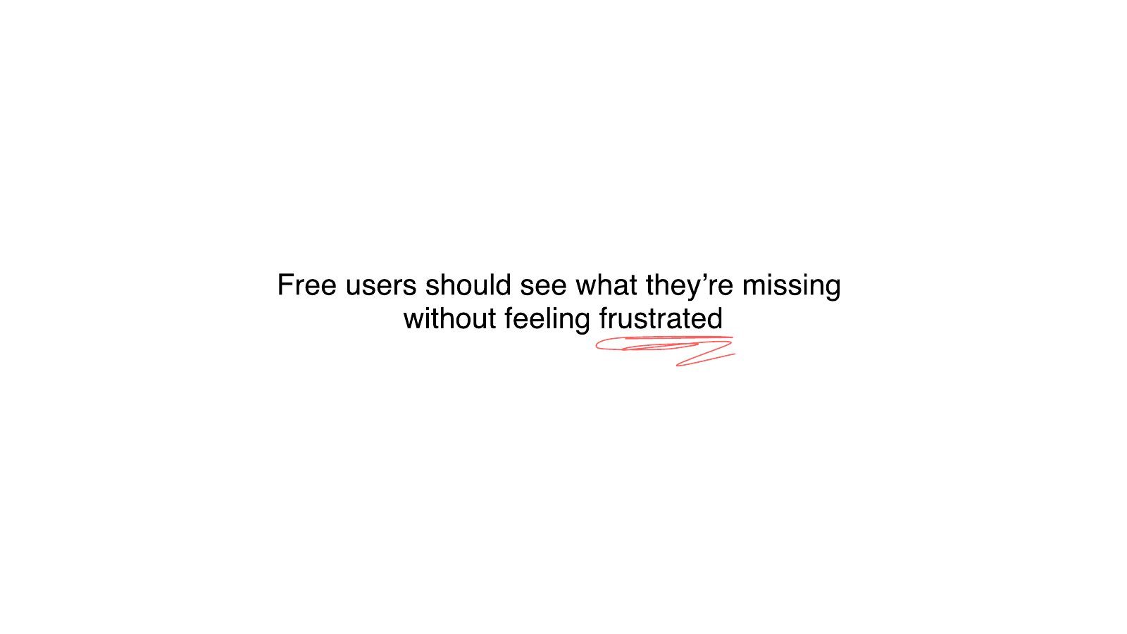
Free had to be good enough to trust the app and build a habit. Pro had to be specific enough that people could see what they were missing, without feeling cheated.
I looked at how other apps split their features. Most of them gate depth and personalisation, and leave the core tracking open.
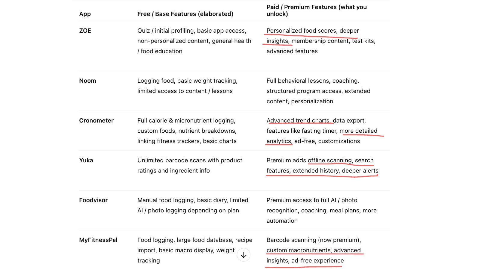
Two things came out of that teardown.
- First, the core tracking is almost never gated, because it's the habit.
- Second, the paid features that convert feel like a deeper version of what the person already does.
Noom gates the full behavioural lessons and coaching. Cronometer gates advanced trend charts and data export. MyFitnessPal gates barcode scanning and custom macronutrients.
What kind of trial should it be?
The trial is how people feel Pro before they pay. Its length decides how much data a person has built before the decision.
What happens across the trial lifecycle?
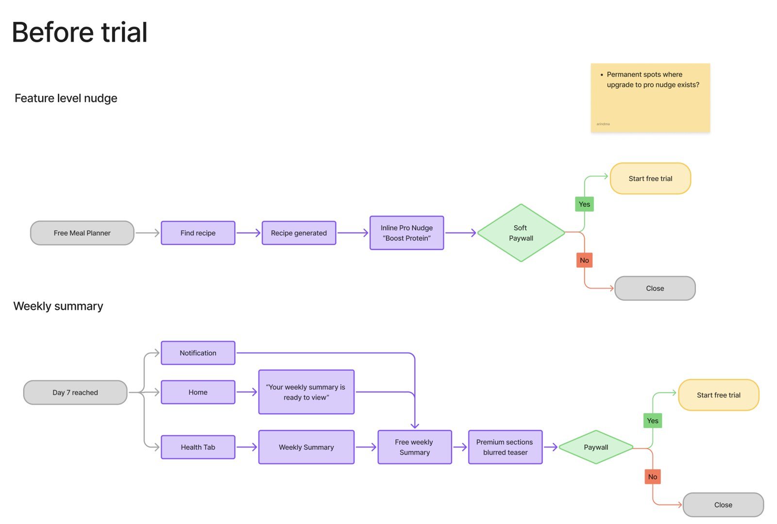
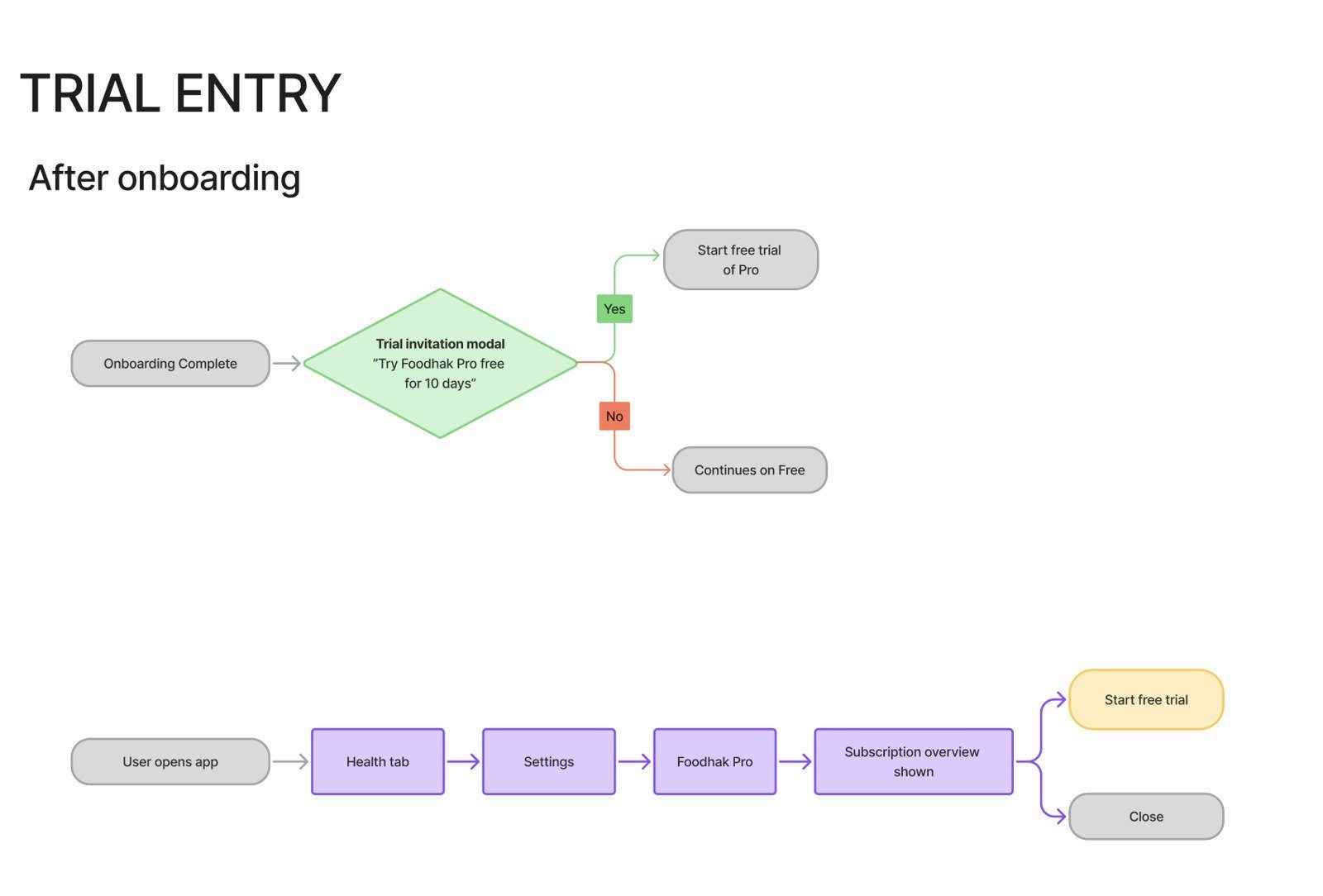
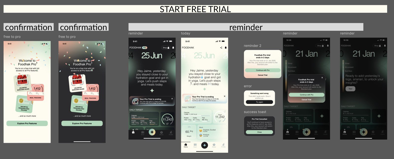
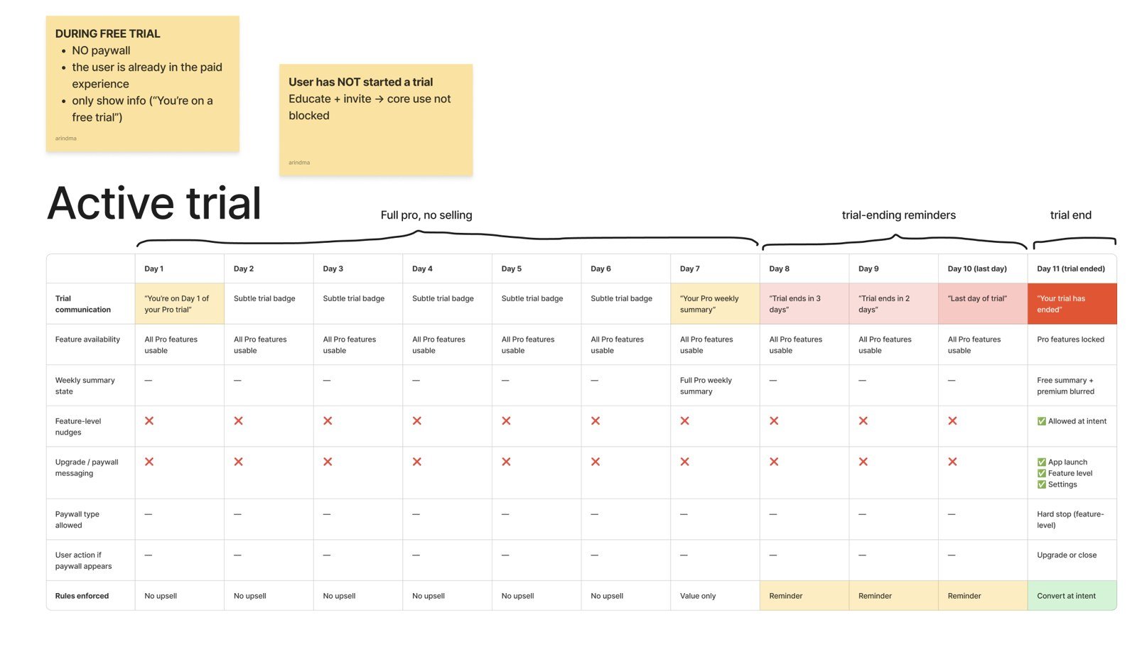
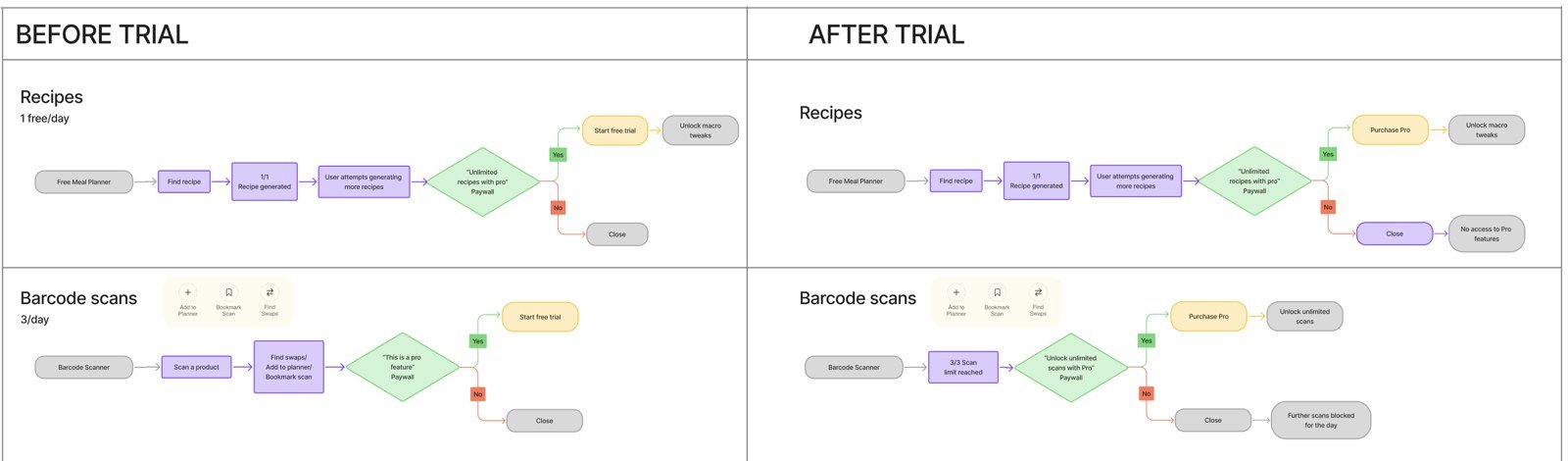
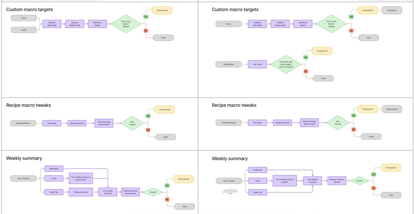
The trial is a lifecycle, and each stage needs its own rules. I mapped every stage as a flow for the developers, including the people who never start a trial, the trials that end without a payment, and the payments that fail.
Where and when do the paywalls appear, and how do they feel?
The paywalls had to appear at the right moment, and only then. I looked at when someone is most likely to care about Pro.
What does the weekly summary sell?
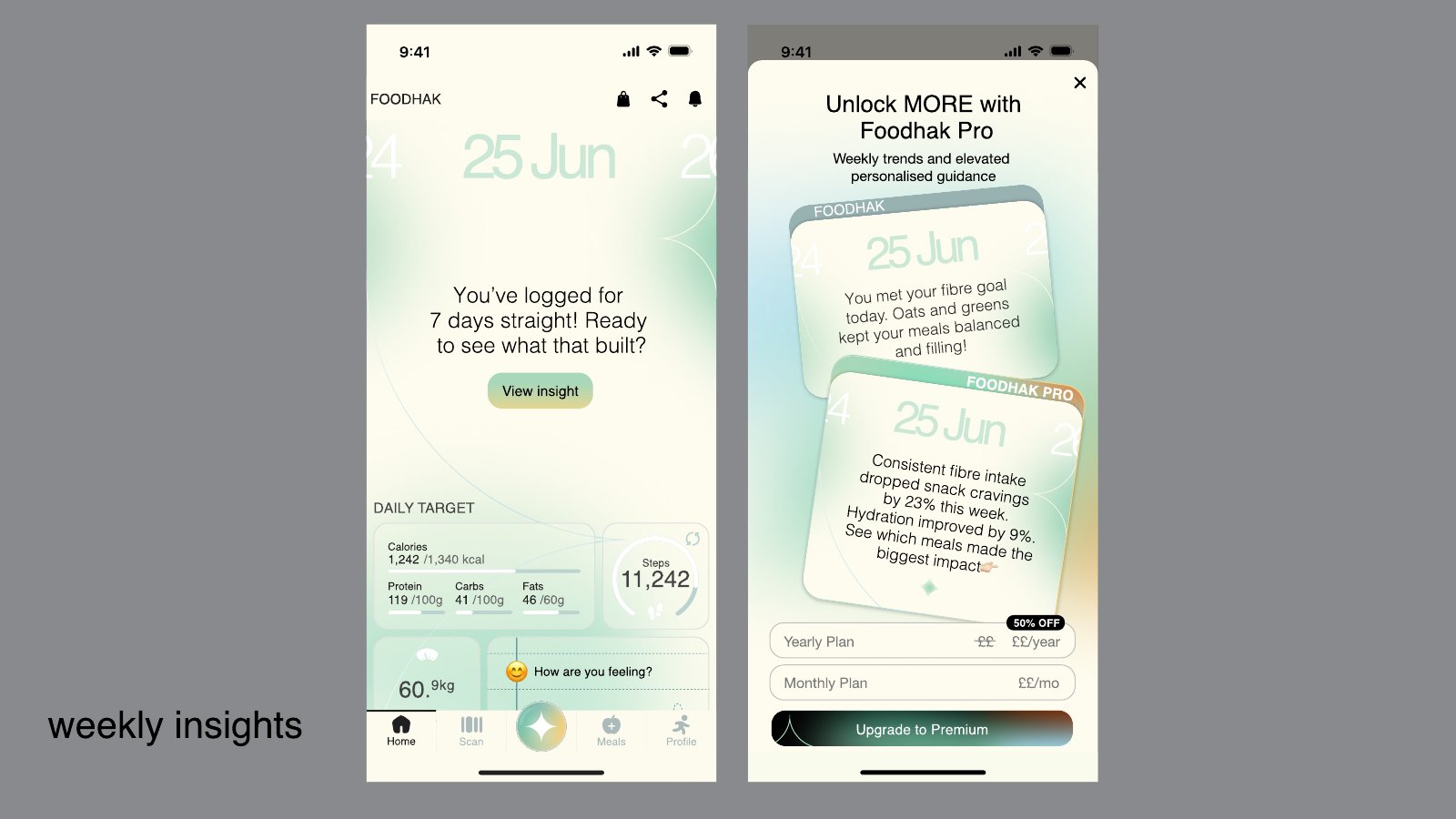
The weekly summary was the first Pro feature I built, and it anchors Pro. It turns a week of logging into a story the person can read in a minute, and the full version is the main reason to pay.
There are two versions:
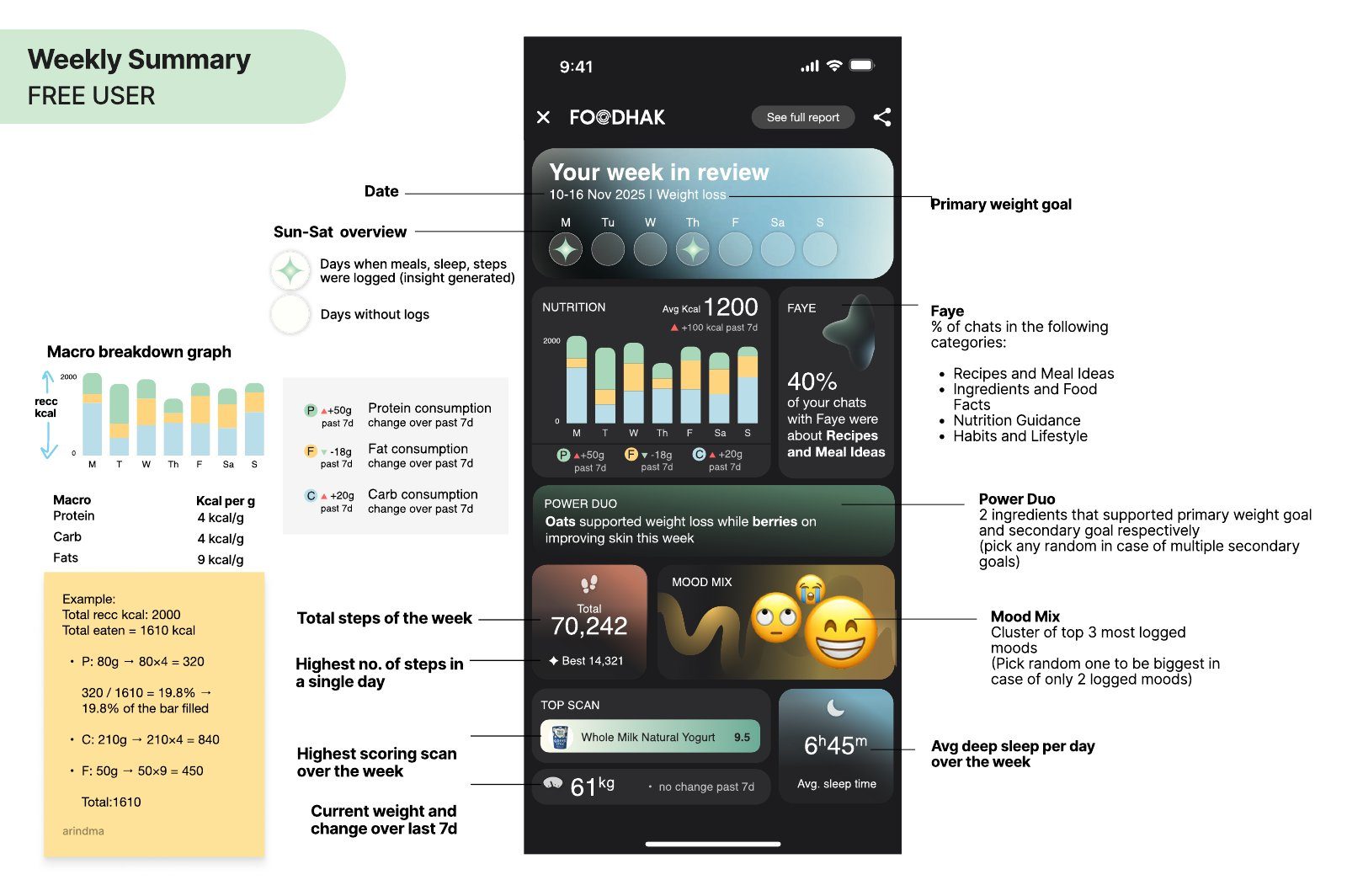
- Free: a short weekly summary, ending with a "See full report" call to action.
- Pro: the full report, with the complete analysis and a shareable card.
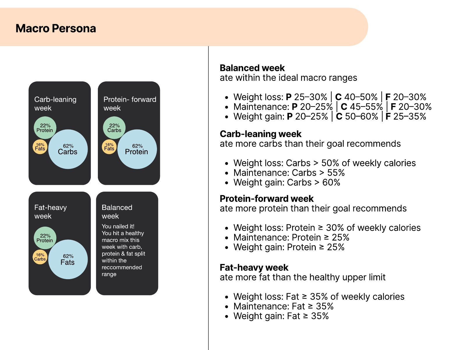
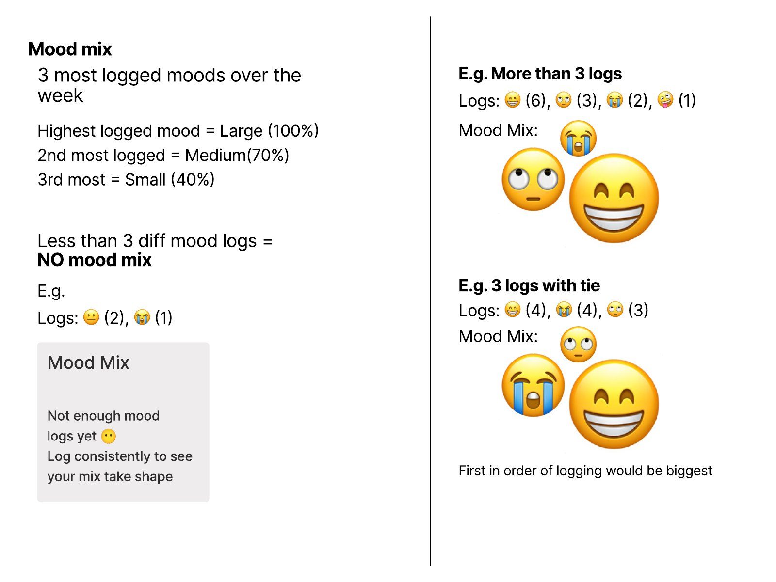
I wrote the rules for the weekly summary, so the developers could build the logic without guessing. They are below, as I wrote them.
How does a free app make money when its AI costs money every time it thinks?
The Foodhak split
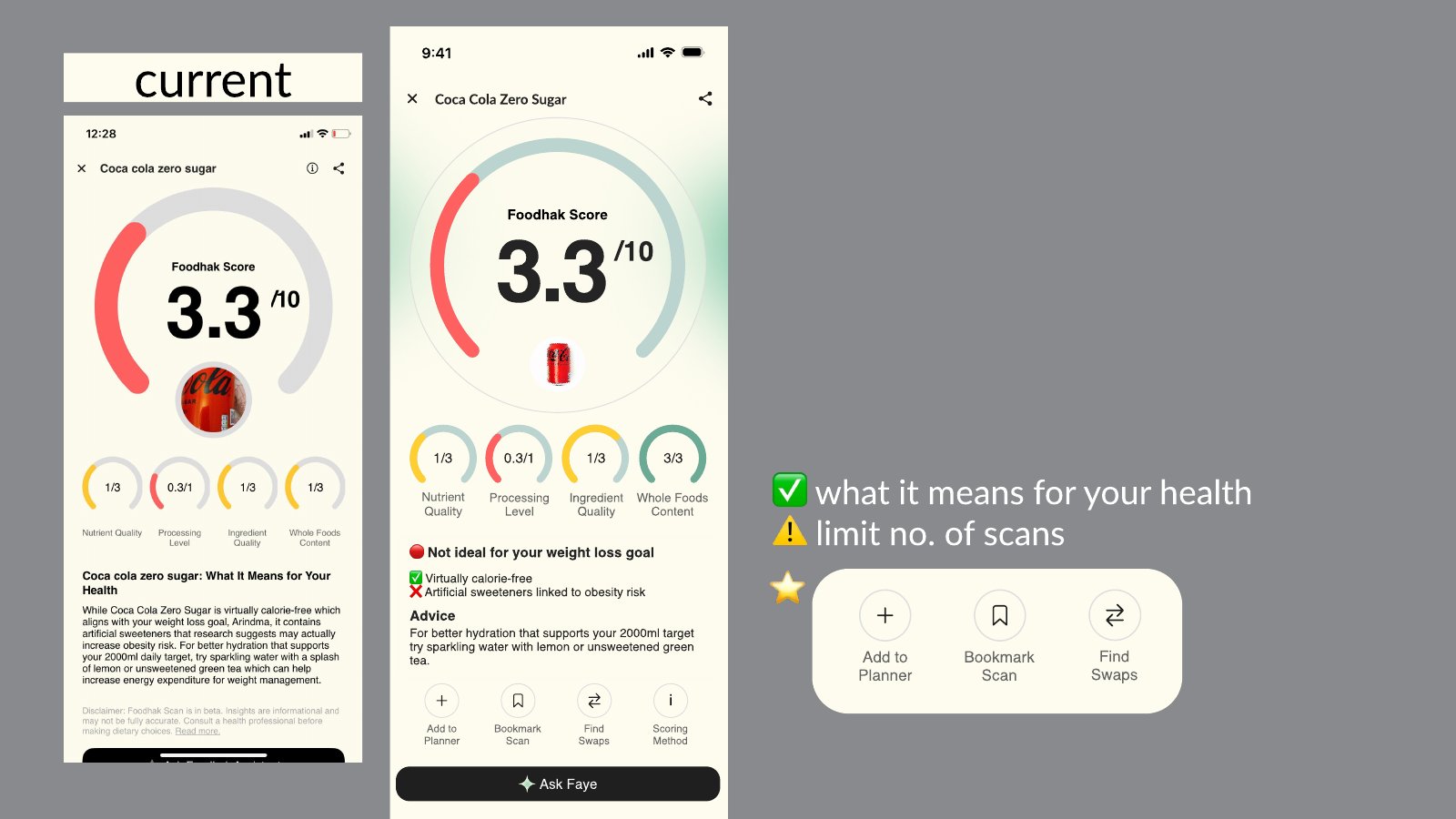
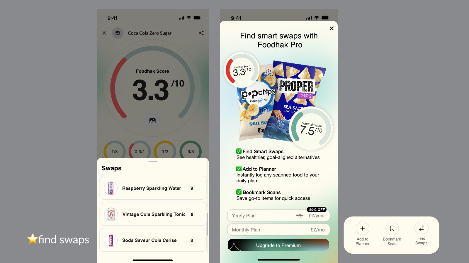
- Scanning and logging. Free gets a limited number of scans, and the Foodhak score explains what it means for your health. Pro adds smart swaps, instant logging to the planner and bookmarks.
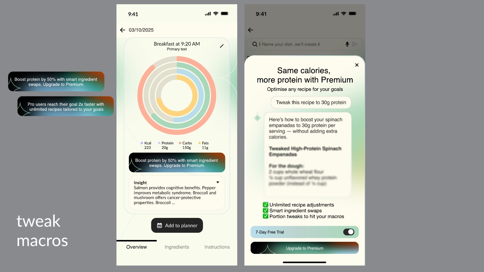
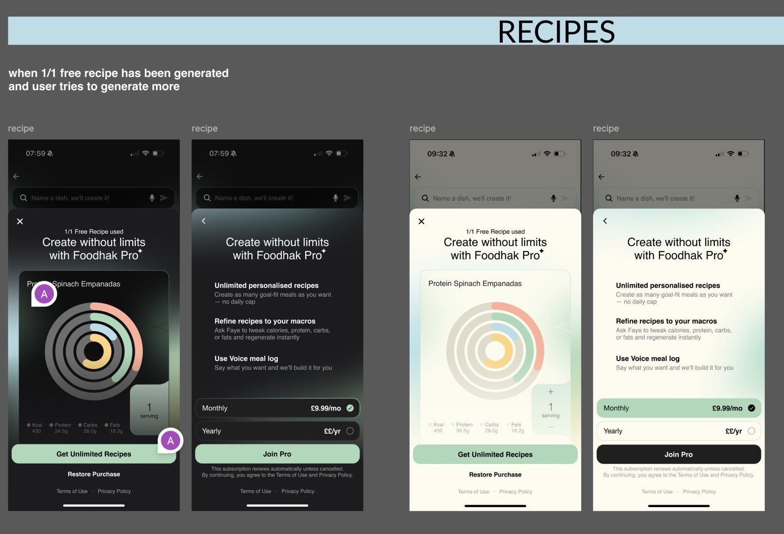
- Recipes. Free gets one recipe a day. Pro unlocks unlimited, goal-based recipes and lets people tweak protein, carbs or fibre.
What kind of trial should it be?
The options
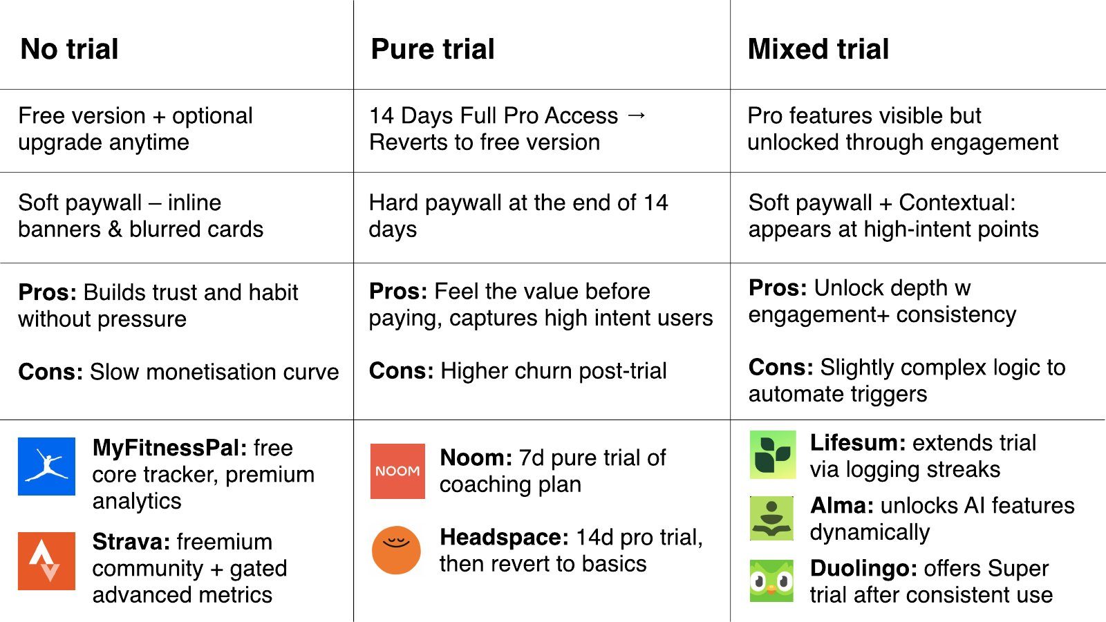
There were three ways to structure the trial. I laid them out side by side for the stakeholders.
- No trial: Shape: Free version, optional upgrade any time; Paywall: Soft: inline banners and blurred cards; Pros: Builds trust and habit without pressure; Cons: Slow monetisation curve
- Pure trial: Shape: 14 days of full Pro, then back to free; Paywall: Hard paywall at the end of 14 days; Pros: Lets people feel the value before paying, captures high-intent users; Cons: Higher churn after the trial ends
- Mixed trial: Shape: Pro features visible, unlocked through engagement; Paywall: Soft paywall, plus contextual nudges at high-intent points; Pros: Unlocks depth with engagement and consistency; Cons: Slightly complex logic to automate the triggers
What the benchmark says
I based the trial length on data. The RevenueCat *State of Subscription Apps 2025* benchmark covers more than 20,000 apps, from January to December 2024.
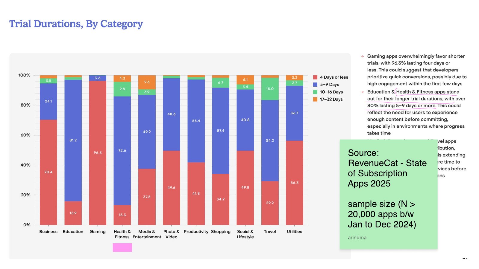
The benchmark gave me three things to work with:
- Trial length depends heavily on category. Gaming apps mostly favour short trials, with 96.3% lasting four days or less. Education and Health & Fitness apps lean longer, with over 80% lasting five to nine days or more, which fits a product where progress takes time.
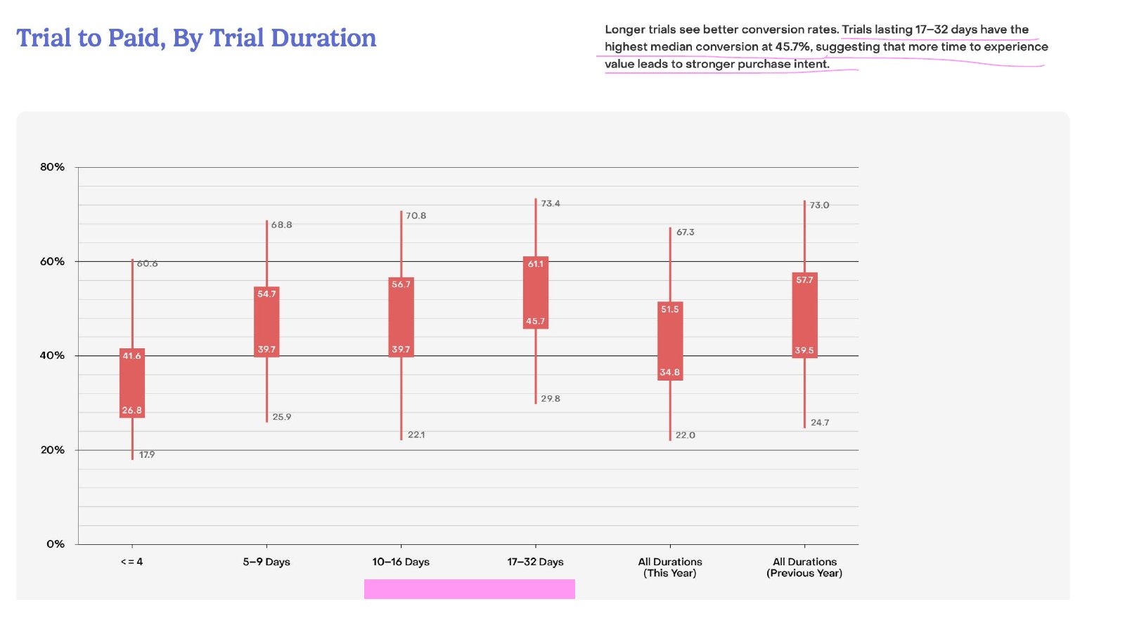
- Longer trials convert better, up to a point. Trials of 17 to 32 days had the highest median trial-to-paid conversion, at 45.7%.
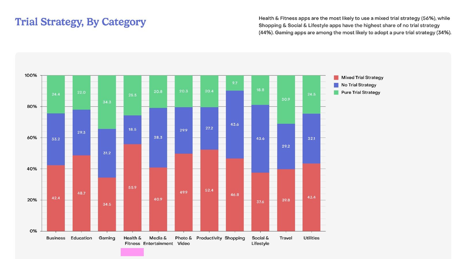
- Health & Fitness apps are the most likely to use a mixed trial strategy, at 56%.
The decision
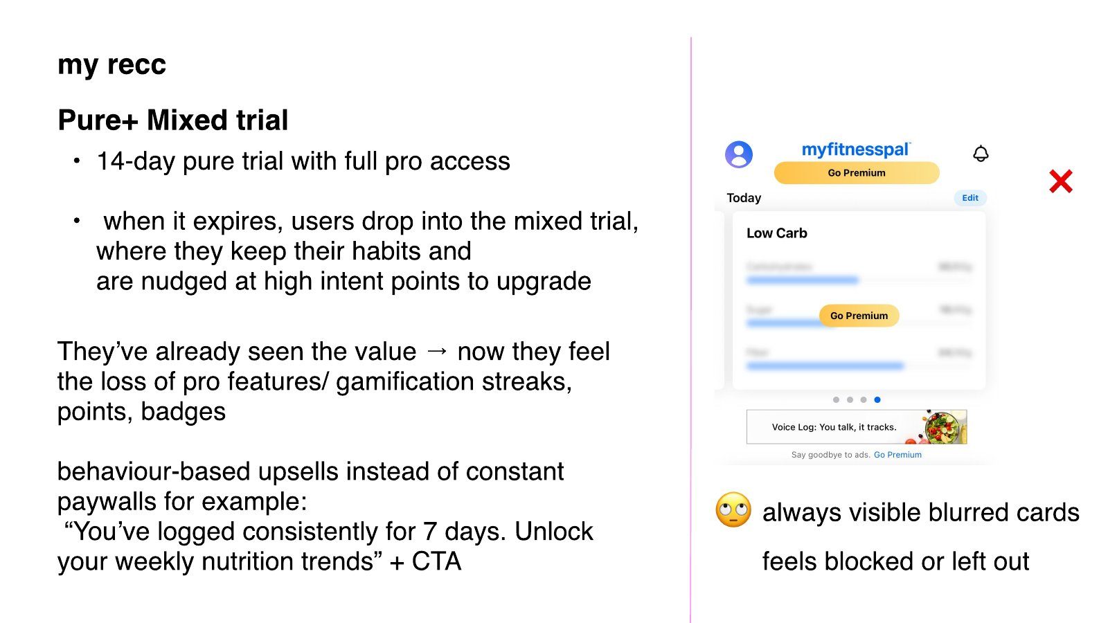
My recommendation: Pure trial, then mixed.
Fourteen days of full Pro access lets people see what a week of data looks like and start building streaks. When the trial expires, they drop into the mixed tier. They keep their habits and get nudged to upgrade at points of high intent. By day 14 they've built data and streaks, so losing Pro feels like losing something that's theirs. That's loss aversion, and it works without a hard sell.
The flows were built so the trial length could move to 10 days later. I pitched 14 days. After the stakeholder meeting with the founder, director and product owner, the decision was 10 days.
What happens across the trial lifecycle?
On trial
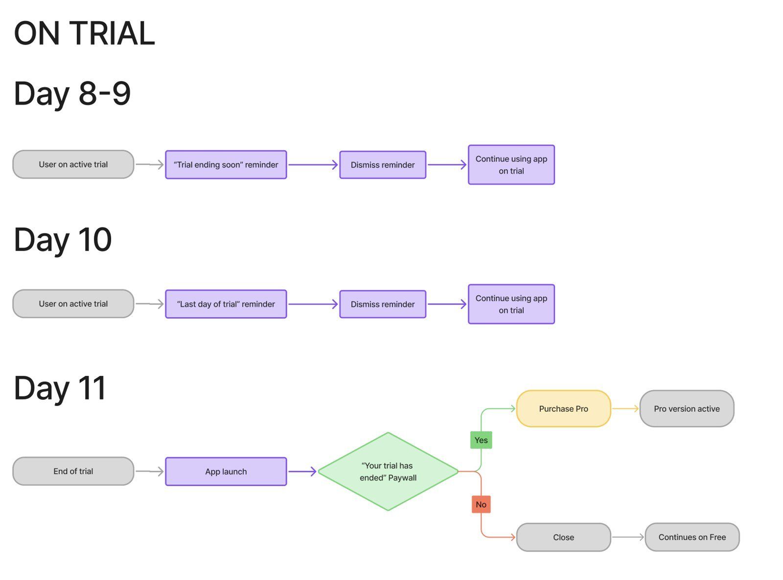
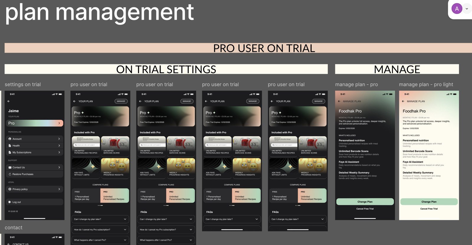
During the trial, the person has full Pro access. The flow has checkpoints on days 8 to 9, day 10 and day 11, so the nudges land as the trial nears its end.
After the trial
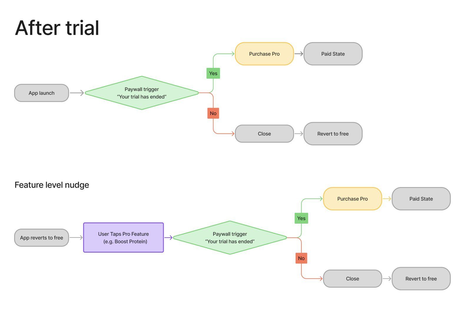
When the trial ends, people drop into the mixed tier. They keep their habits, and the paywall appears only at high-intent points.
Inactivity
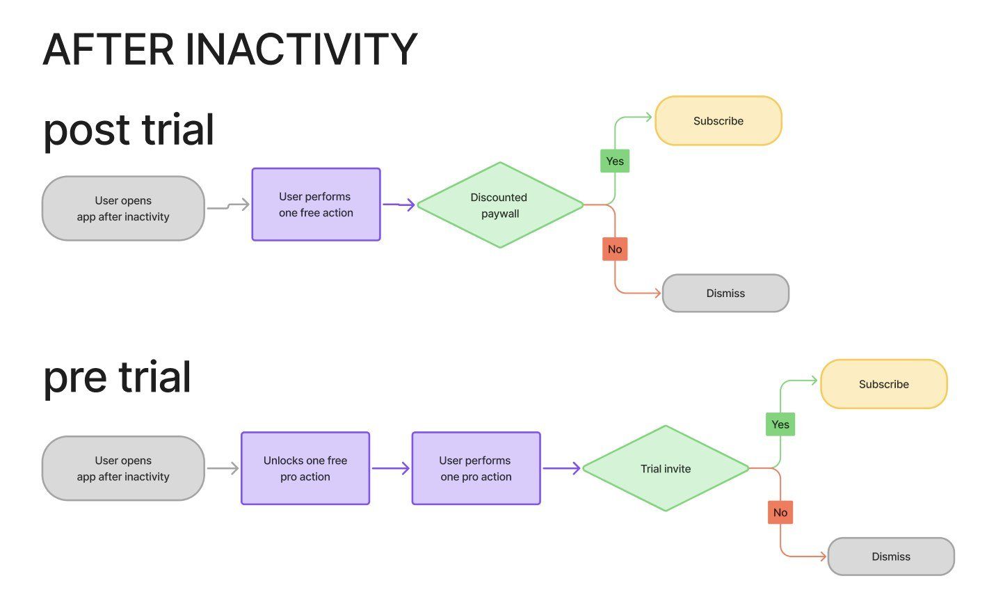
People who stop opening the app need a different path from people who are active. I mapped the pre-trial and post-trial inactivity flows separately.
Managing and cancelling
Cancelling is where trust is decided. The person should always know what happens next, and they should be able to leave without being trapped.
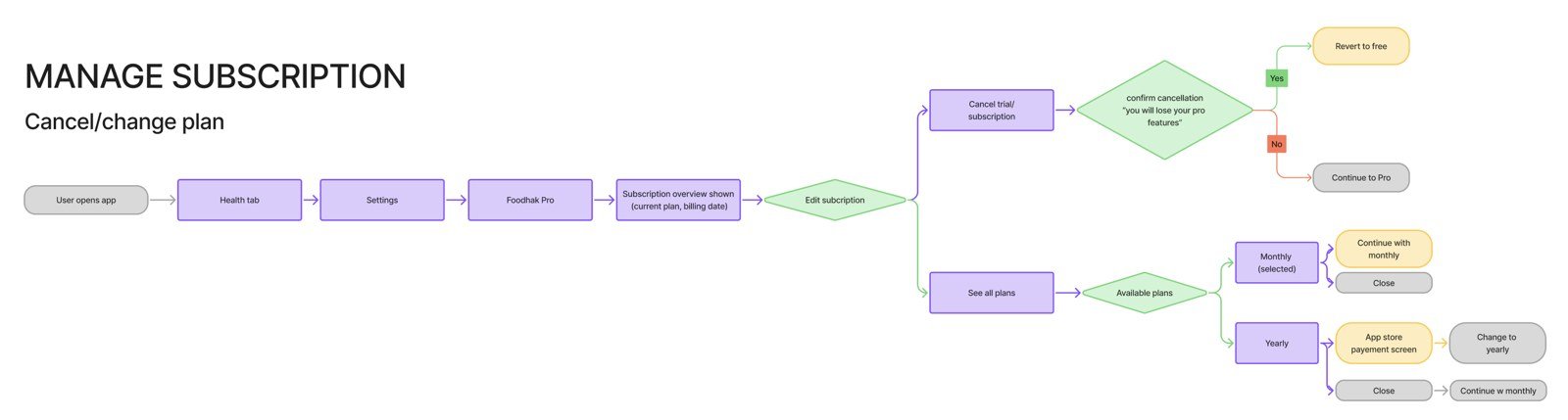
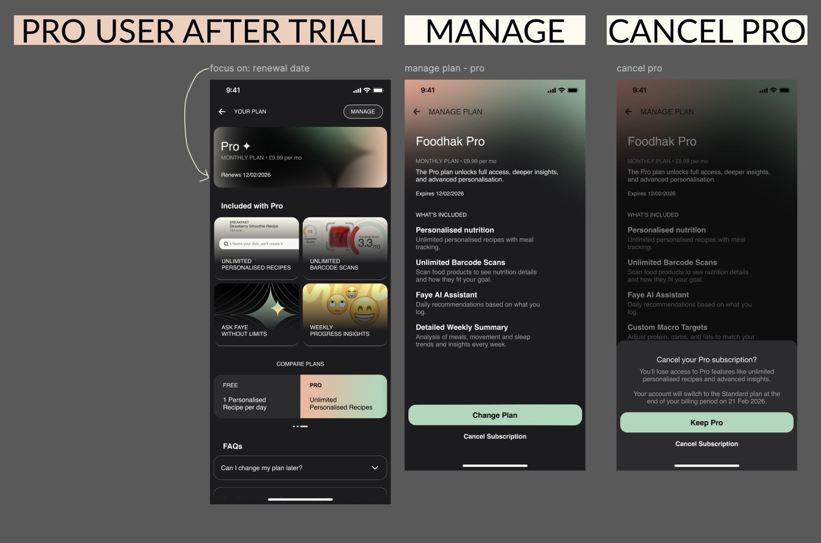
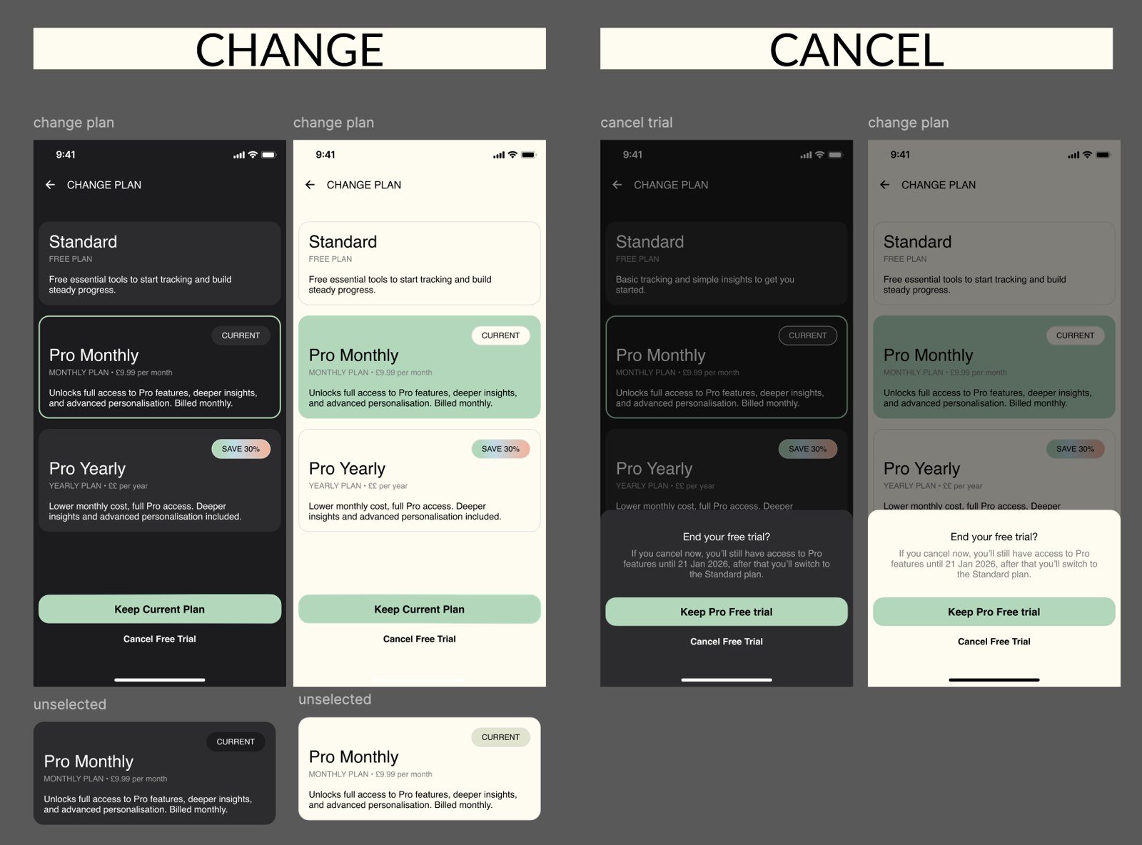
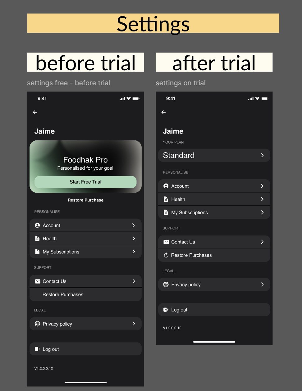
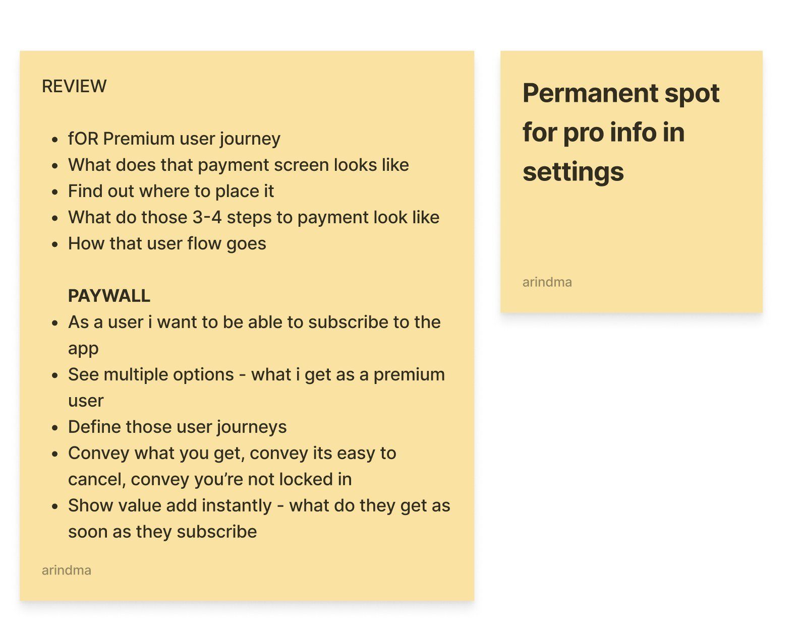
For the Pro user journey I wrote a review on sticky notes: what the person wants to do, what the payment screen looks like, and what they should see at each step. One note stayed with me. Give Pro information a permanent place in Settings, so people can always find out what they have and how to change it.
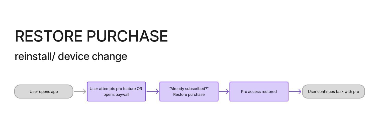
Restoring a purchase
People reinstall the app or change device, and their purchase should come back without a fight.
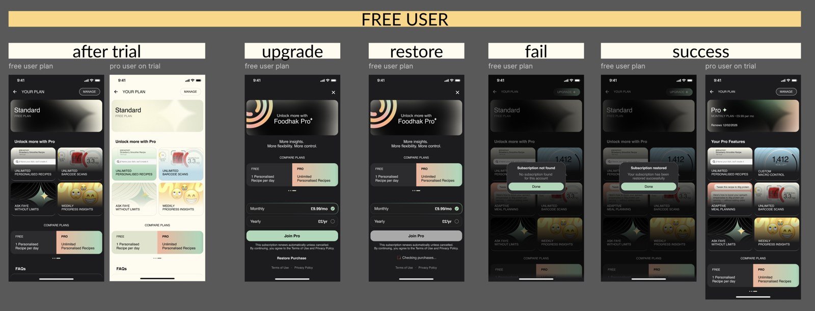
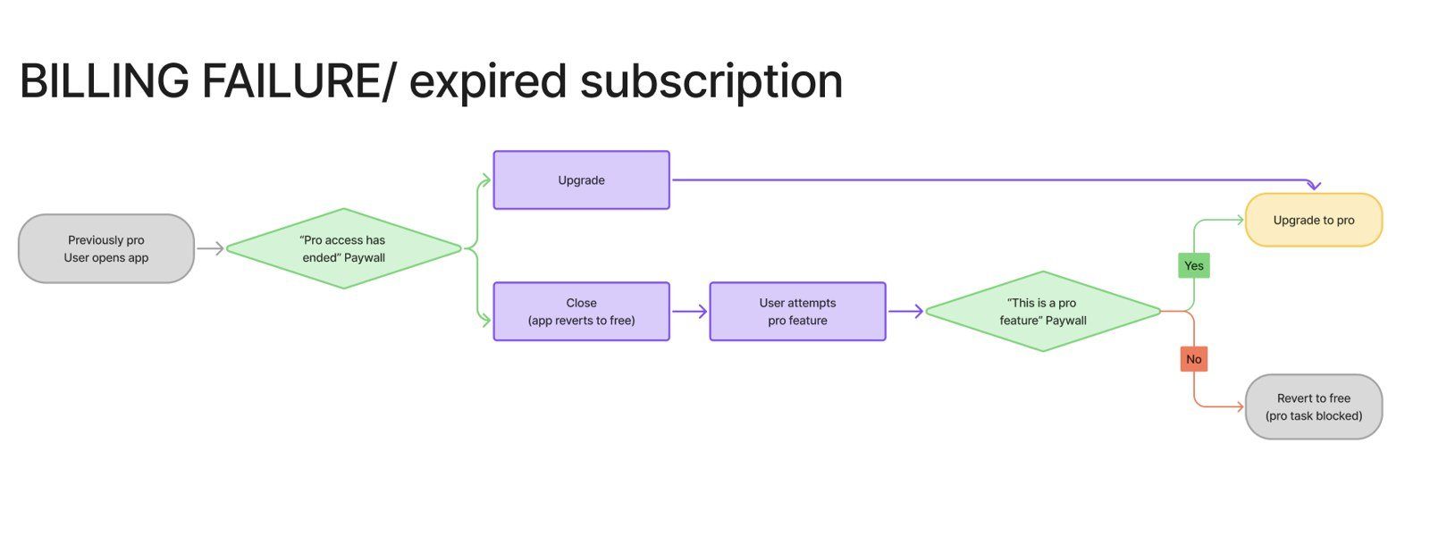
When billing fails
A failed payment is a moment of anxiety. I designed each state separately: the offer, the upgrade, the restore, the failure and the success.
Where and when do the paywalls appear, and how do they feel?
Where the trigger points are
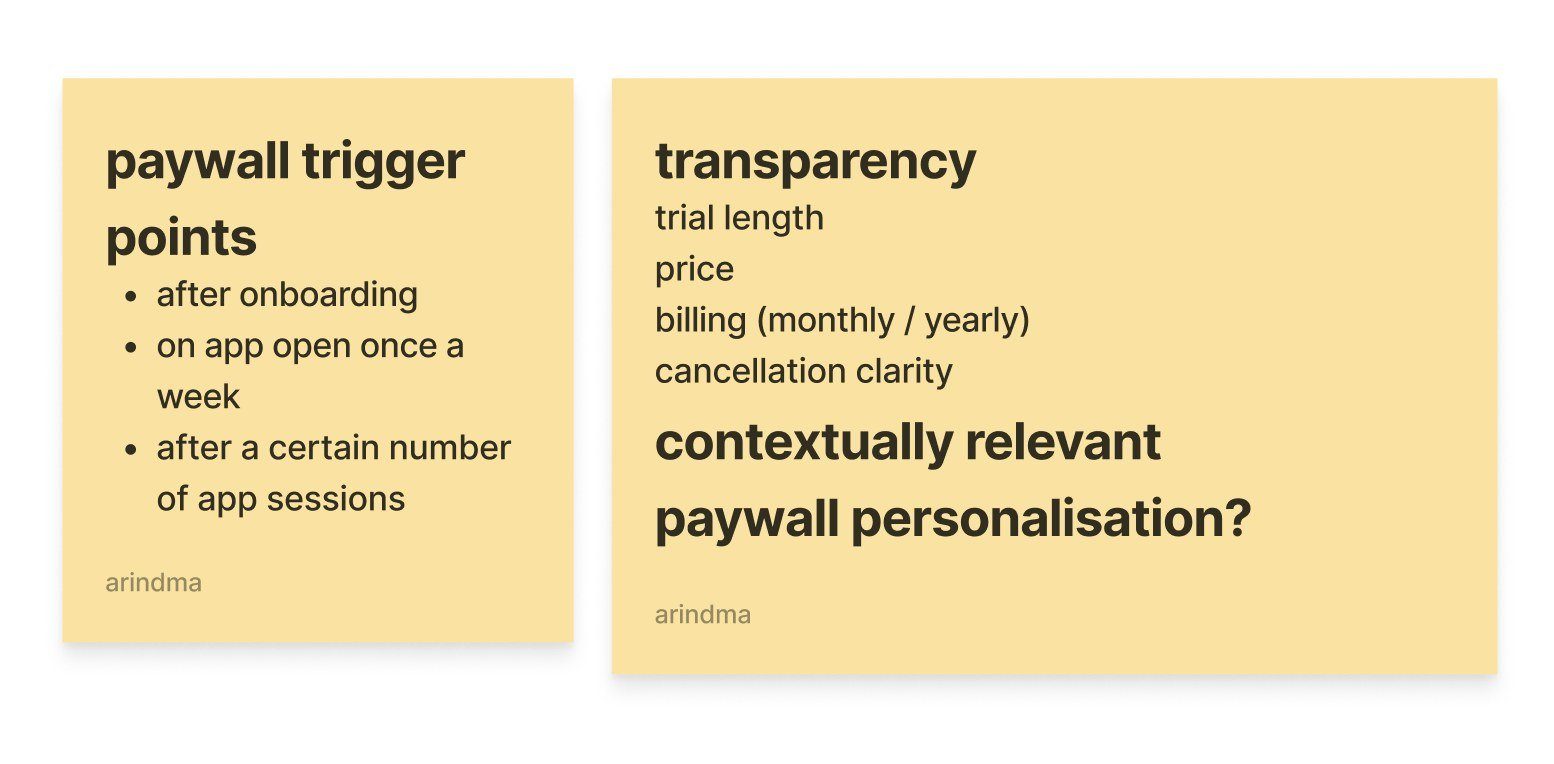
The paywall fires at three moments:
- After onboarding.
- When the app is opened once a week.
- After a certain number of app sessions.
The transparency rules sit alongside these: the trial length, the price, the billing (monthly or yearly) and how to cancel. People should know exactly what they're signing up for.
The variable reward
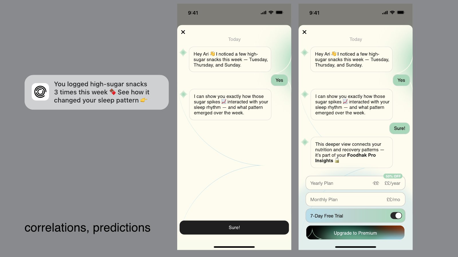
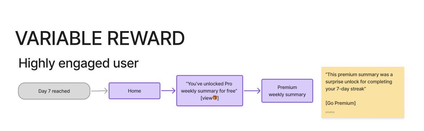
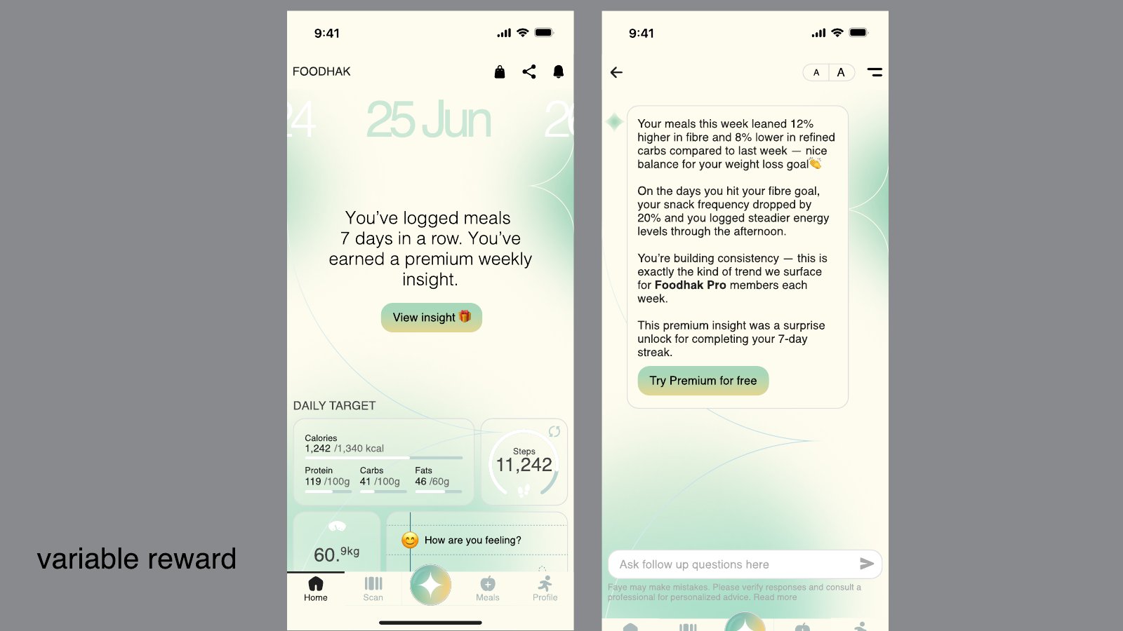
The strongest trigger is a reward the person has already earned. For a highly engaged user, the app shows what their logging has built, and the weekly insight becomes the moment to upgrade.
One paywall, three versions
The same paywall can be opened from three places, and each version should lead with what that person came for. I used Duolingo's paywall as the reference:
- From the shop or hearts, the focus is unlimited hearts.
- From ads, the focus is no ads.
- From the review tab, the focus is personalised practice.
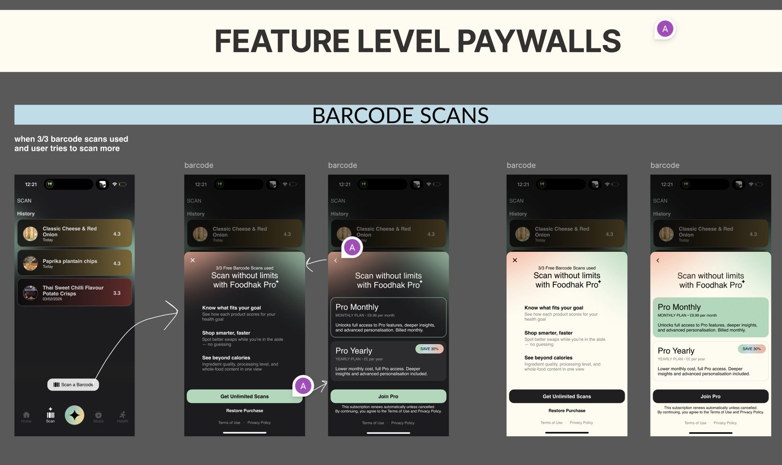
Feature paywalls
Each gated feature got its own paywall, so the upsell matches what the person just tried to do.
The trial paywall
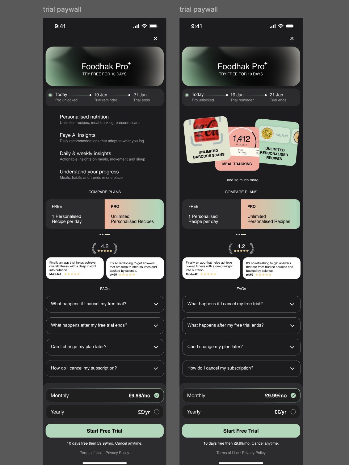
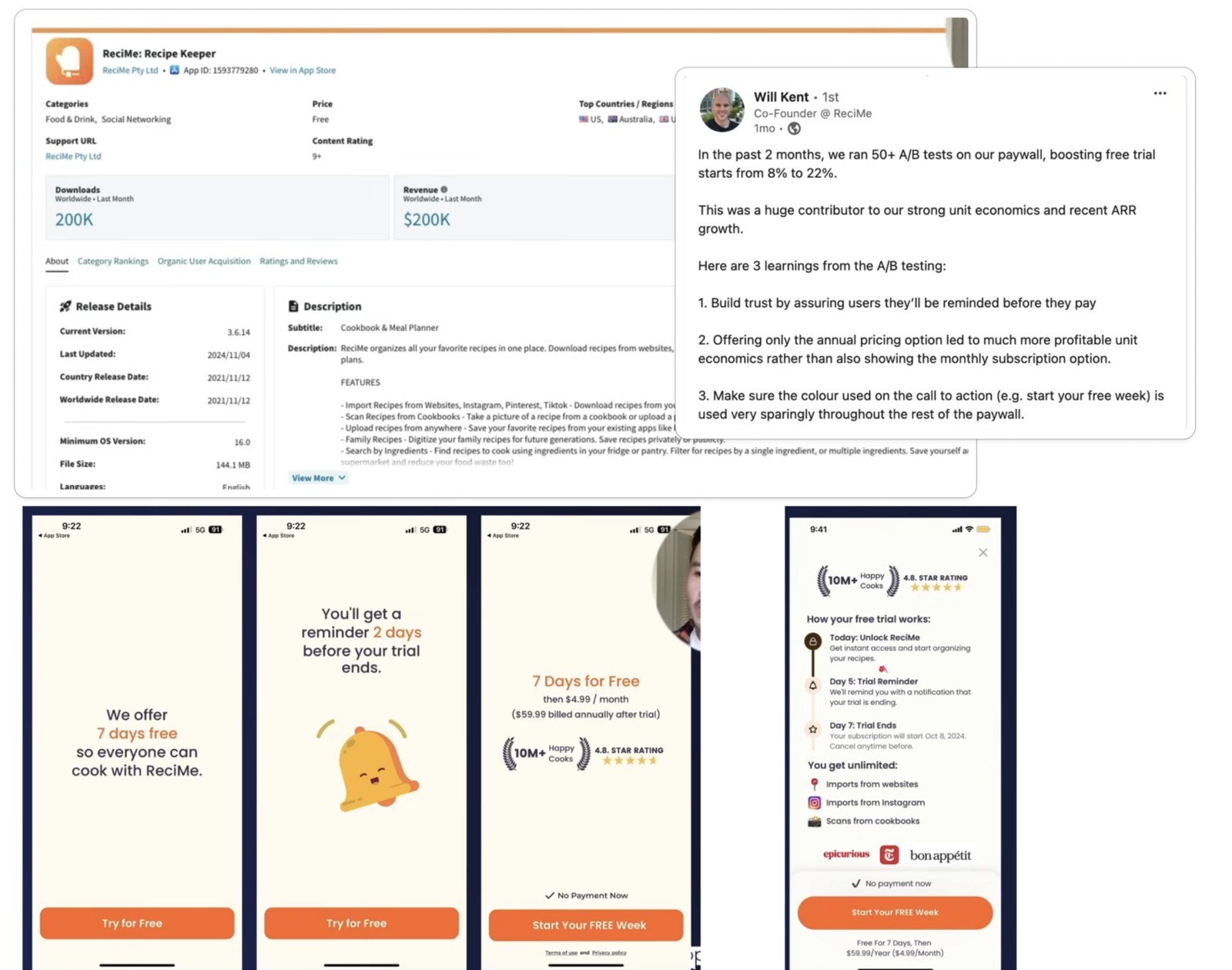
The trial paywall shows the price and the trial length. The entry point comes after onboarding.
The research behind it
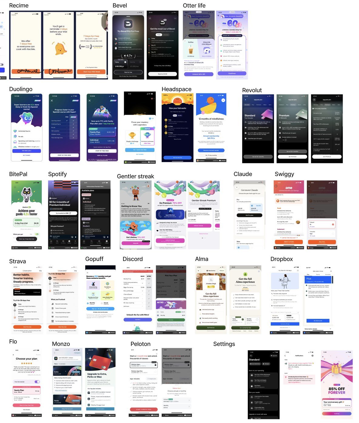
I collected paywall examples from other apps to see how they introduce the offer, and which features they put behind it.
The tension I didn't fully solve
The hardest part was the blurred cards. A locked feature shown as a blurred preview tells people the thing exists, which helps conversion. It also makes the app feel like it's keeping things from them.
My recommendation was to swap constant blocking for behaviour-based upsells. Instead of a blurred card on every screen, show a paywall once someone has earned it:
You've logged consistently for 7 days. Unlock your weekly nutrition trends." + CTA
I had two reasons. A blurred card that's always there feels like being left out. And the upsell lands harder when it arrives after the person has shown they care. I have no test results for the alternative, so this stays a recommendation I haven't been able to prove.
Options I rejected
- A hard paywall at day one. It asks people to pay before they know what they're paying for.
- A paywall on every screen. It trains people to ignore the upsell, and it makes the app feel like a shop.
- Gating personalisation. That's the product. Selling it would break the promise.
What does the weekly summary sell?
What the Pro report covers
The Pro report is what the summary grows into. Each section answers a question the person has:
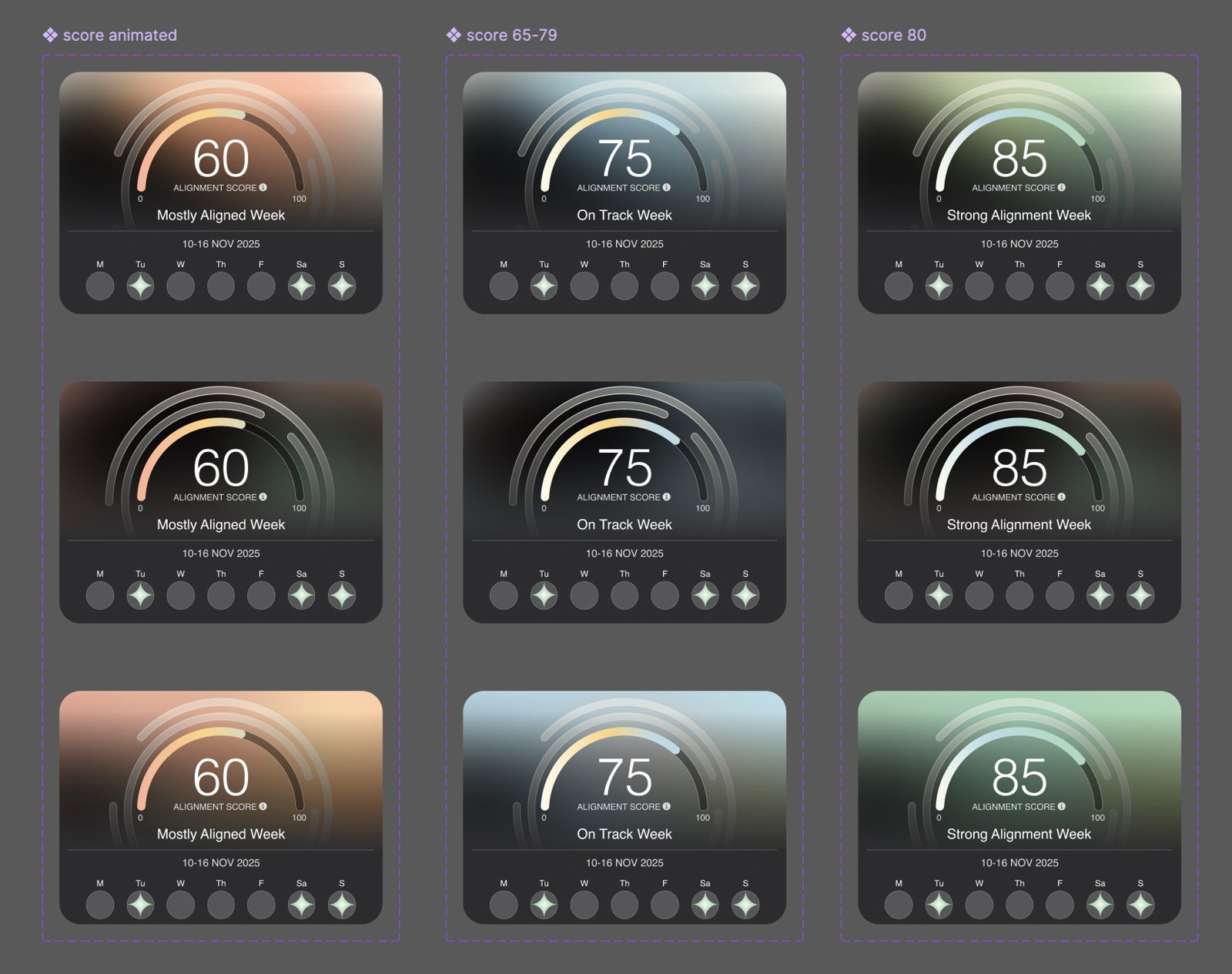
- Alignment score. One number that shows how closely the week matched the person's goal, with a seven-day strip underneath.
- Meals. Average calories, how each macro moved against the week before, and what shaped the score.
- Meals x movement. Calories eaten against steps taken, day by day.
- Steps. The weekly total, a bar for each day, and what shaped the step score.
- Sleep. The average sleep, the sleep duration for each night and what shaped the sleep score.
- Mood mix. The moods logged most often, with a food and mood insight.
- Scans. The number of items scanned and the top-scoring items.
- Next up. A short note on what would lift next week's scores.
Meals, steps and sleep each end with a highlight and one thing to do next week.
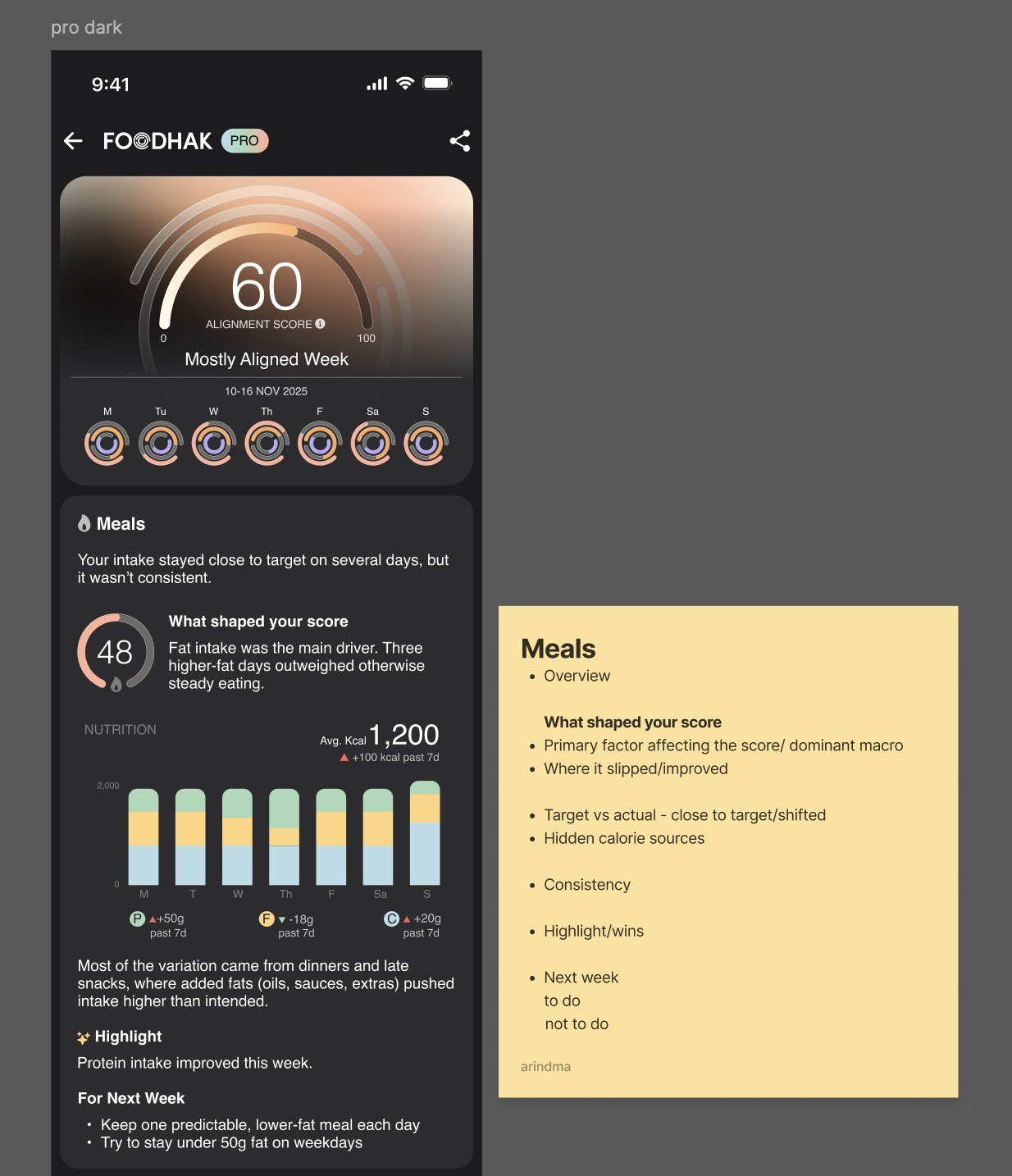
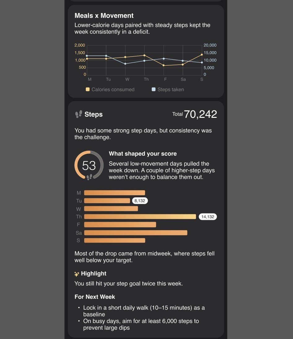
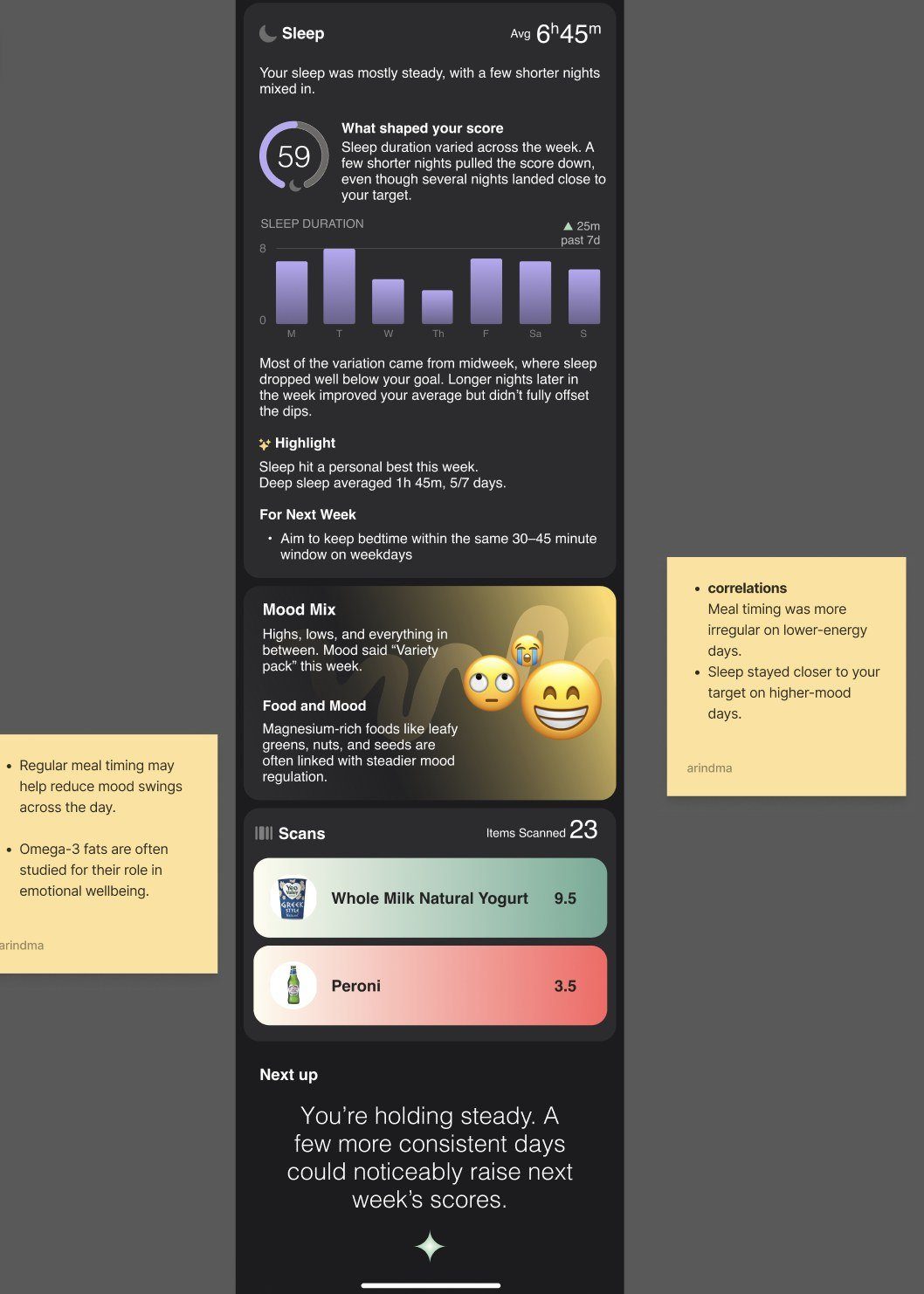
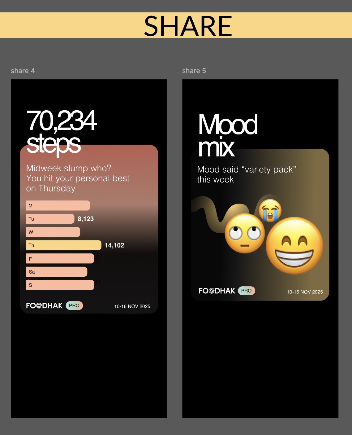
The report is also shareable. People share a single number or their mood mix, and each card is a reason to come back.
The alignment score
The score has three tiers, and each tier has its own label:
- Mostly Aligned Week at 60.
- On Track Week for scores from 65 to 79.
- Strong Alignment Week at 80 and above.
Decisions I made on the report
- Analysis over review. The report explains why a week went the way it did. A list of totals is a log. An explanation is a reason to pay.
- Available to everyone, with no minimum logs. Anyone can see the full report, even after a light week. Requiring a minimum number of logs would have locked out the people who most need the nudge.
- Visually distinct from the free report. The Pro report uses a different treatment, so people can tell at a glance what they're paying for.
- Custom mood. People can either remove the mood section or add their own word for it, so the report can be shaped without a complicated setup.
The hard part
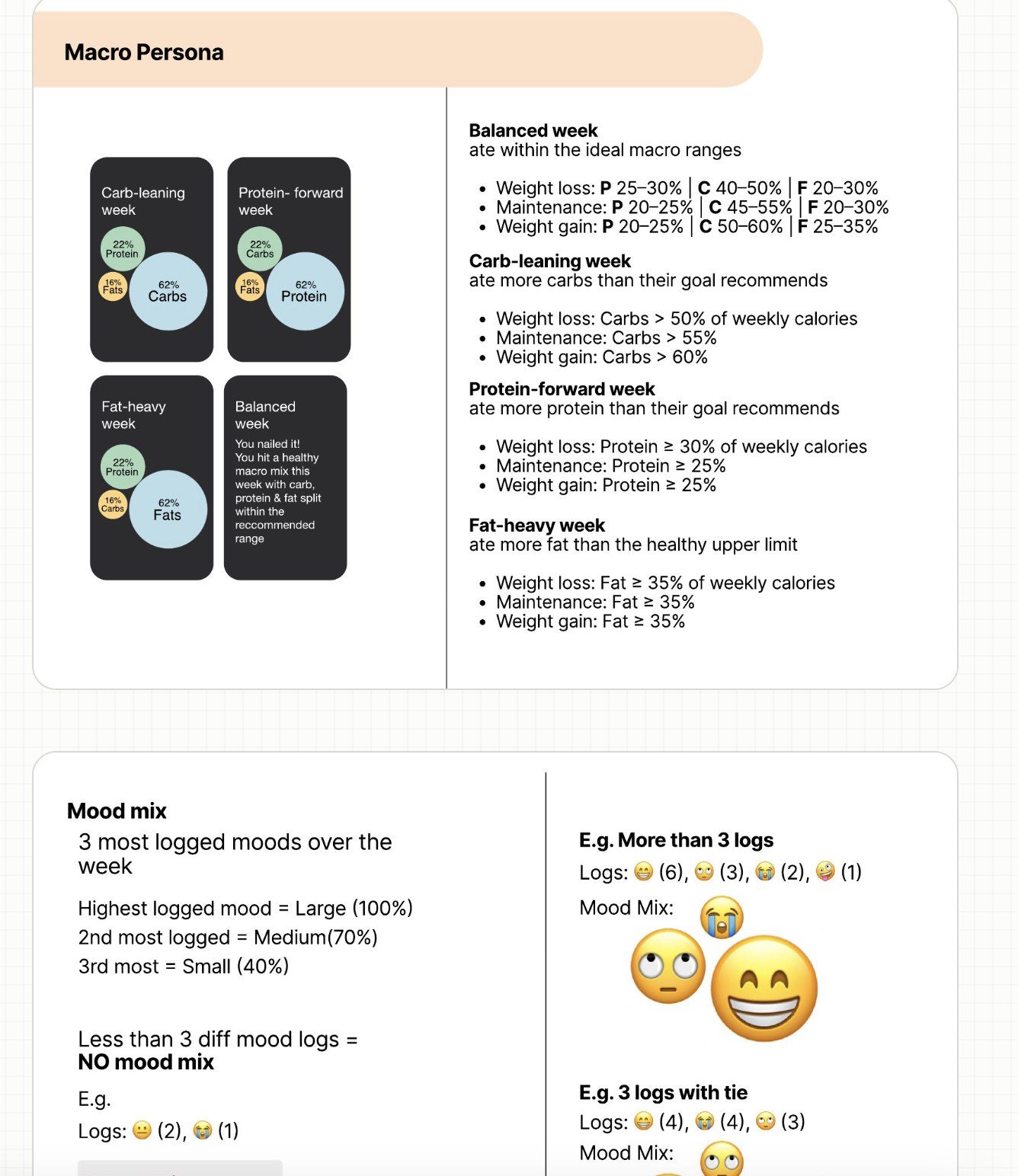
The rules were the hard part. A macro breakdown only makes sense against the person's goal. A protein-heavy week is a good week for someone losing weight, and an unusual one for someone gaining. The Balanced, Carb-leaning, Protein-forward and Fat-heavy labels only work when the thresholds change with the goal, so the rules are written per goal.
The rules, in practice
- Macro persona labels the week against the goal's macro ranges.
- Mood mix shows the top three logged moods, sized by how often they appear. Fewer than three different moods means no mood mix. A tie goes to whichever was logged first.
- Power duo pairs two ingredients from the week: one that supported the primary goal and one for the secondary goal.
Outcome
The weekly summary, paywalls and trial flows were built. Then the company changed direction to a SaMD project, and the work didn't ship.
What I'd carry forward:
- Show value first, then ask. A paywall that comes after someone has seen the value converts better than one that blocks the door.
- Make cancelling easy. A person who can leave without a fight is more likely to stay, and more likely to come back.