Foodhak Packaging Redesign
A packaging redesign that makes a clean, high-protein snack look premium, built around one promise: we’ve got nothing to hide.
This case study covers the problem, the pack and its metallic finish, the front, “We’ve got nothing to hide”, the back, the Foodhak formula and where it went. Or watch the rejected iterations first.
Shipped. Stocked in 100+ independent stores, and with multiple retail partners like H&B, Planet Organic, Ocado, Zapp, Amazon and WH Smith.
- Role
- Sole designer
- Scope
- Packaging design, brand strategy, positioning
- Time
- 2025
- Location
- London
The Intelligent Snack
About Foodhak
Foodhak is a food tech startup making shelf-stable, healthy snacks. The product was brilliant, but the packaging wasn’t translating it.
Watch us review all Foodhak packaging iterations
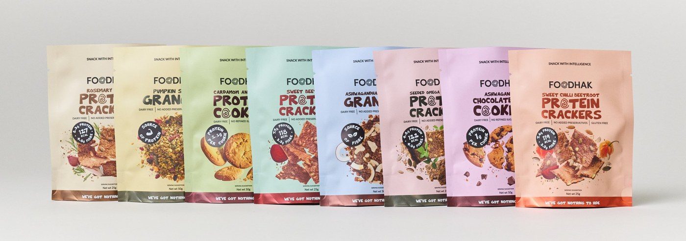
New design 2025 (Minis)
The snacks are high in protein from natural ingredients, with no added preservatives. The seeded omega crackers, for example, combine several seeds that are good for you, with high protein and high fibre.
The problem
The brand had grown from chilled meals into a snack range and a D2C AI-powered Personalised Nutrition app, and by January 2025 there were too many promises in play.
The brand carried promises like amazing taste, clinical research, ancient wisdom, clean ingredients, personalisation and more.
Shoppers had no single reason to pick the pack.
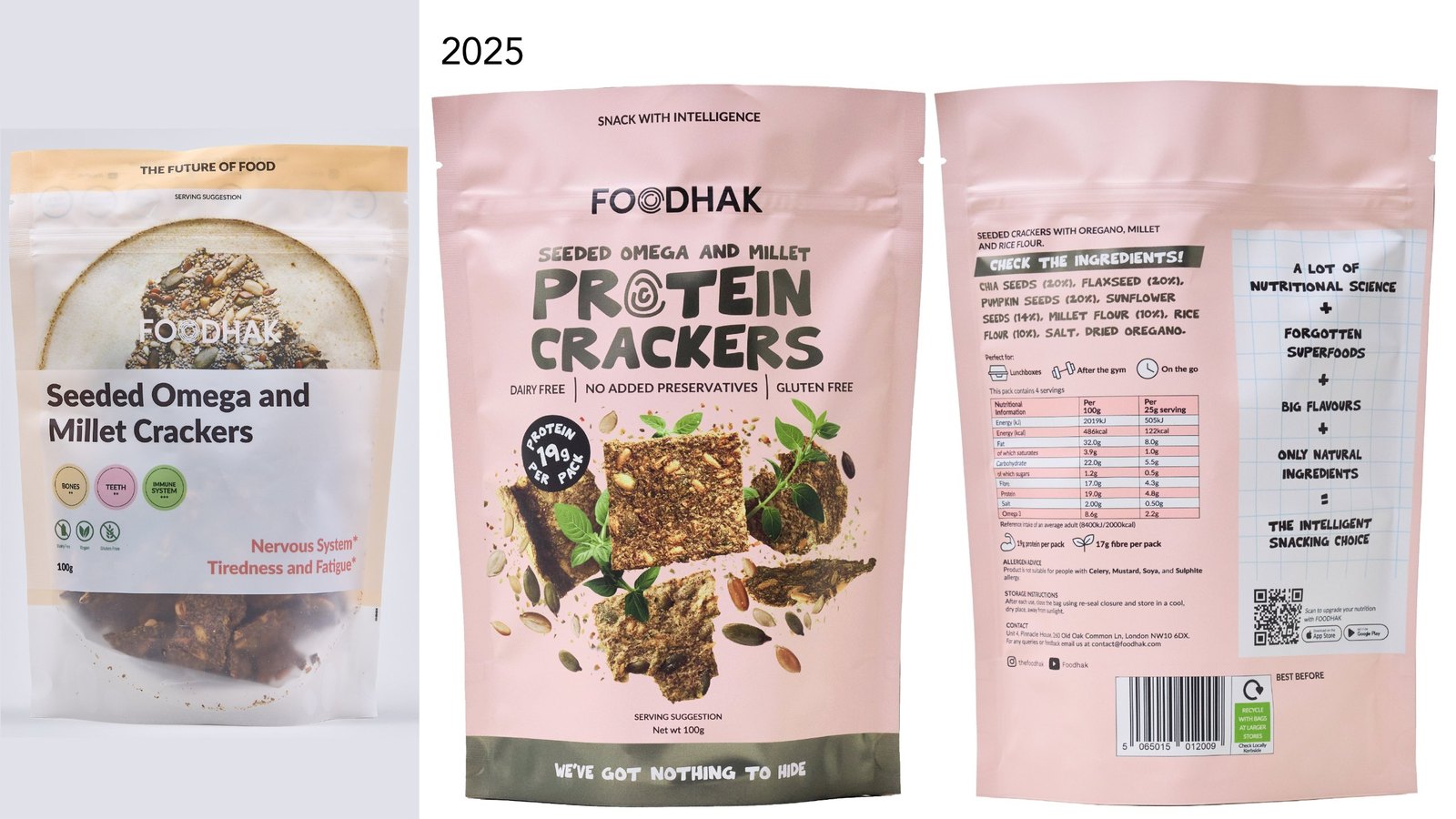
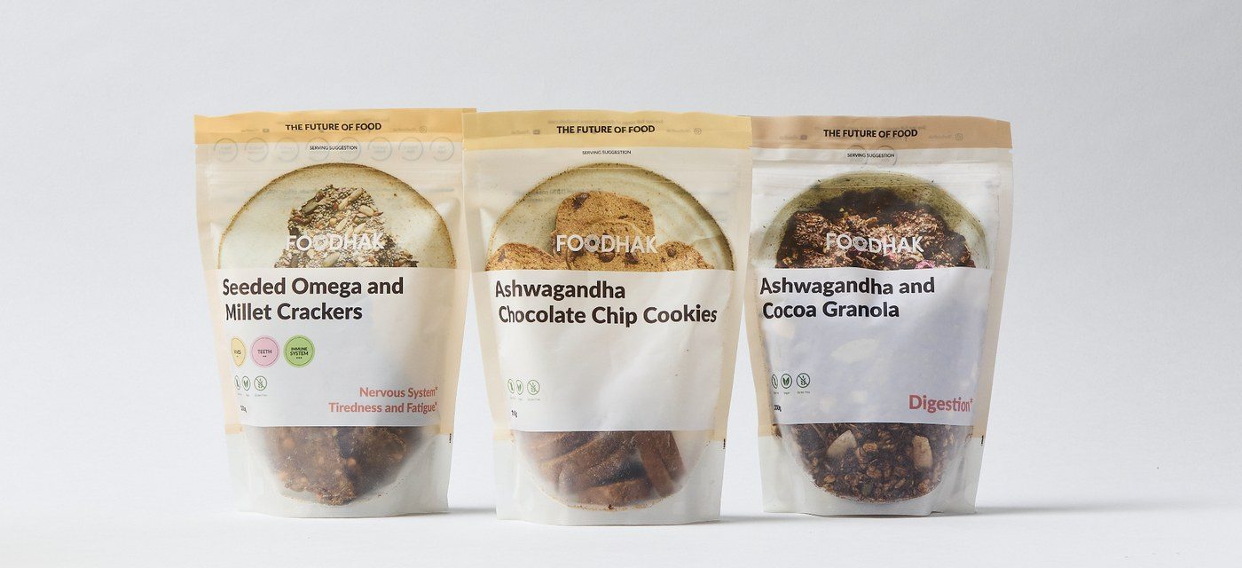
The old packs were mostly white and plain. A beige band and a circular product photo were most of the design, and the claims were small. They were not very appealing, and they did not look premium. On shelf, they didn’t stand out.
The solution: The Intelligent Snack
Food Intelligence is the proposition, and The Intelligent Snack is the product promise.
The Intelligent Snack suggests the one and only.
It also leaves room for a family of intelligence: intelligent ingredients, intelligent choices and more.
The app is the way you hack your health, so the pack keeps it separate from the food.
The brand promise tying it together was the better choices you can believe in.
The pack had to make this clear in a few seconds, without a paragraph of explanation.
People eat with their eyes first
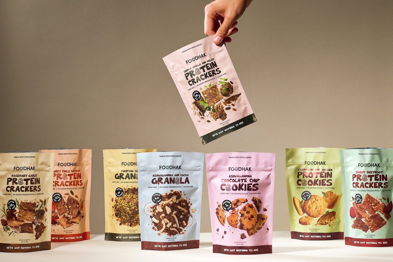
Before anything else, the pack had to make people hungry. That meant the colours had to say food first, and the packs had to look like something worth eating.
The early options were loud, and we were still exploring the positioning, with lines such as “Hak your health”. We eventually went with a pastel palette.
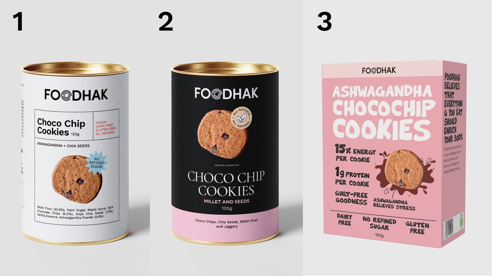
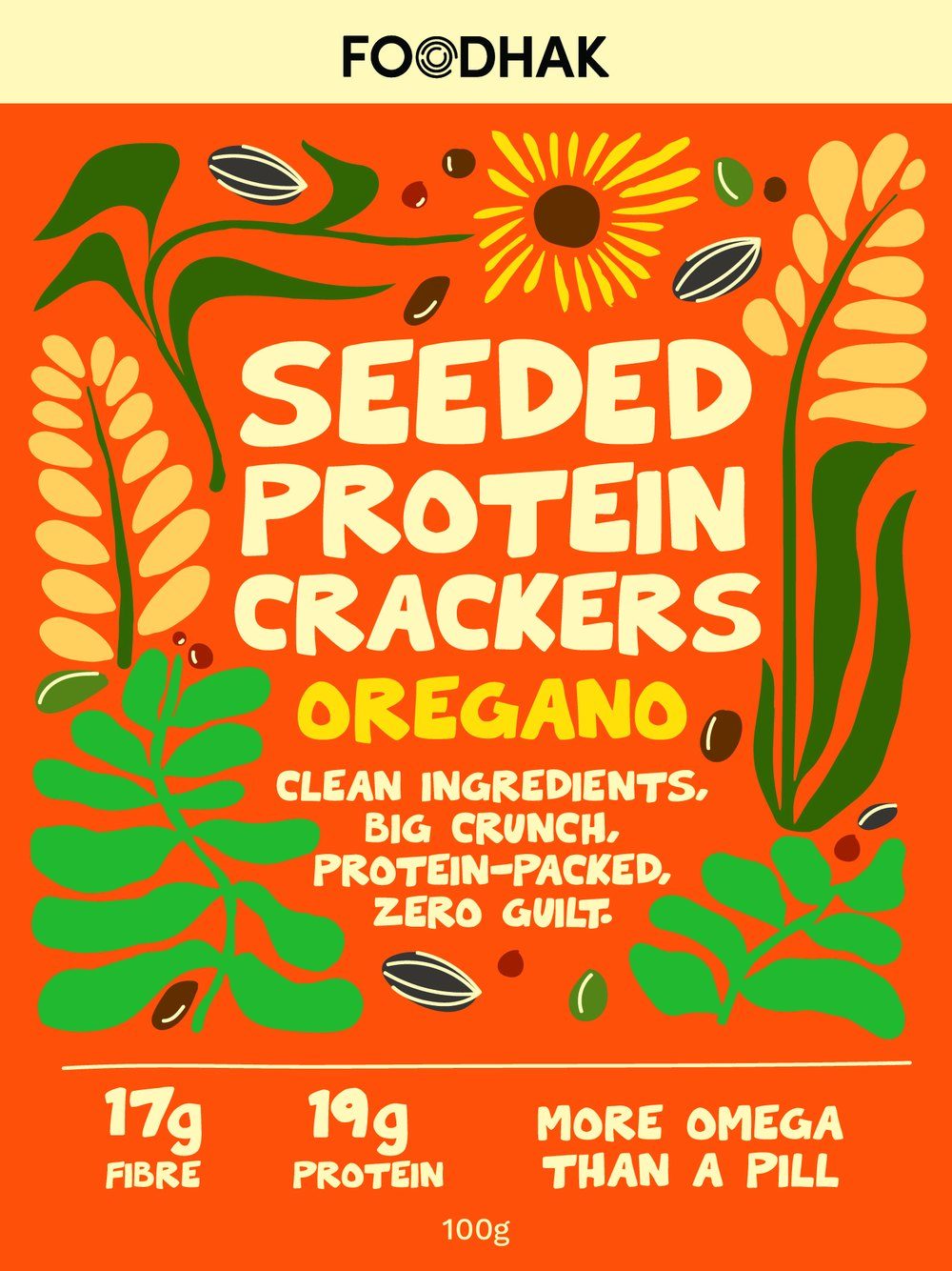
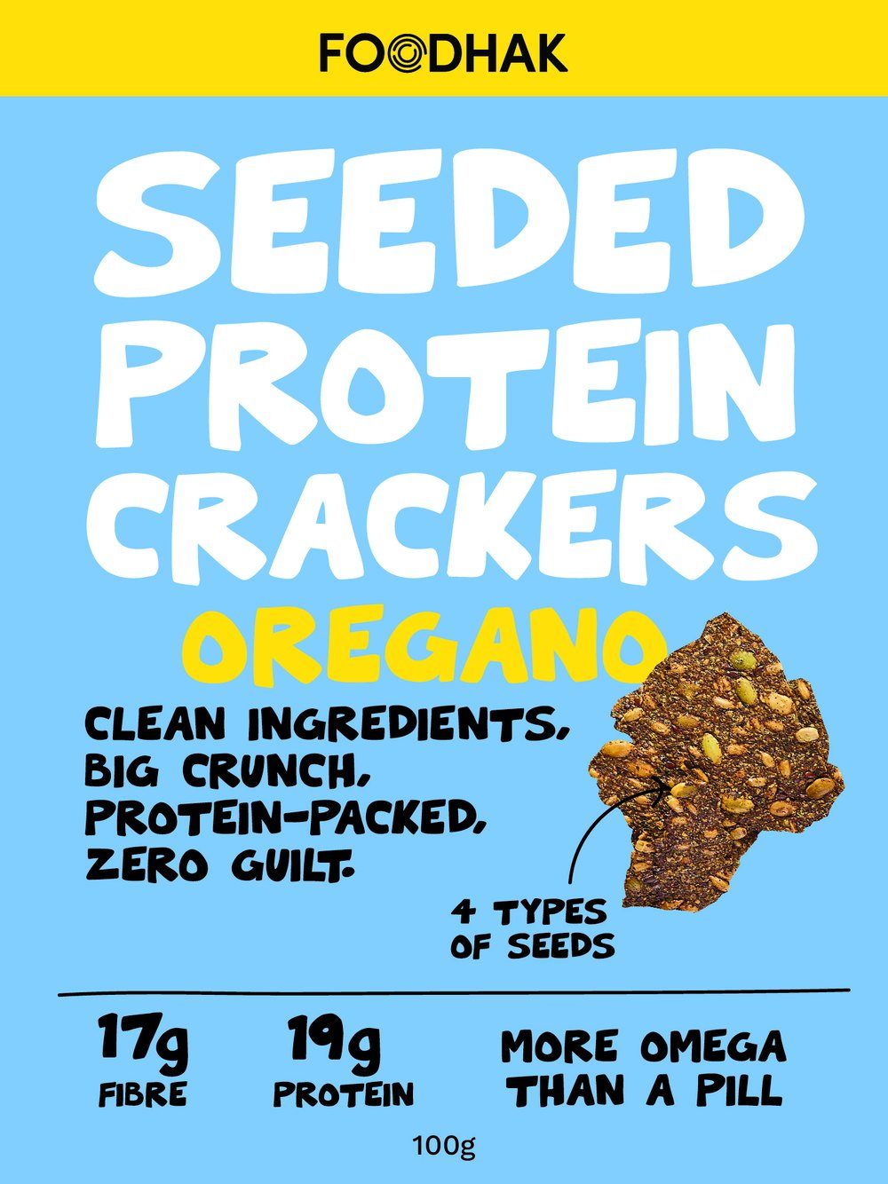
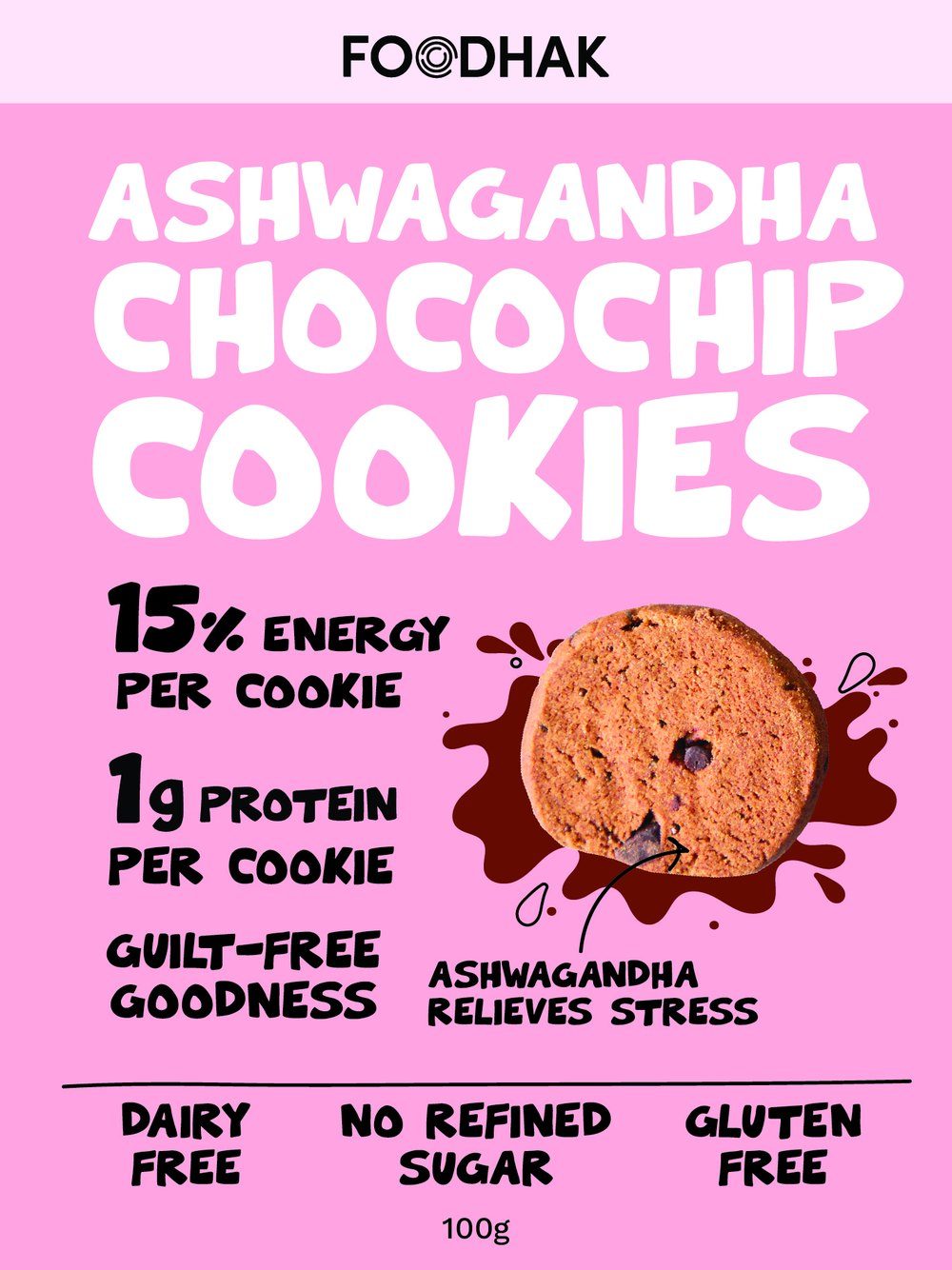
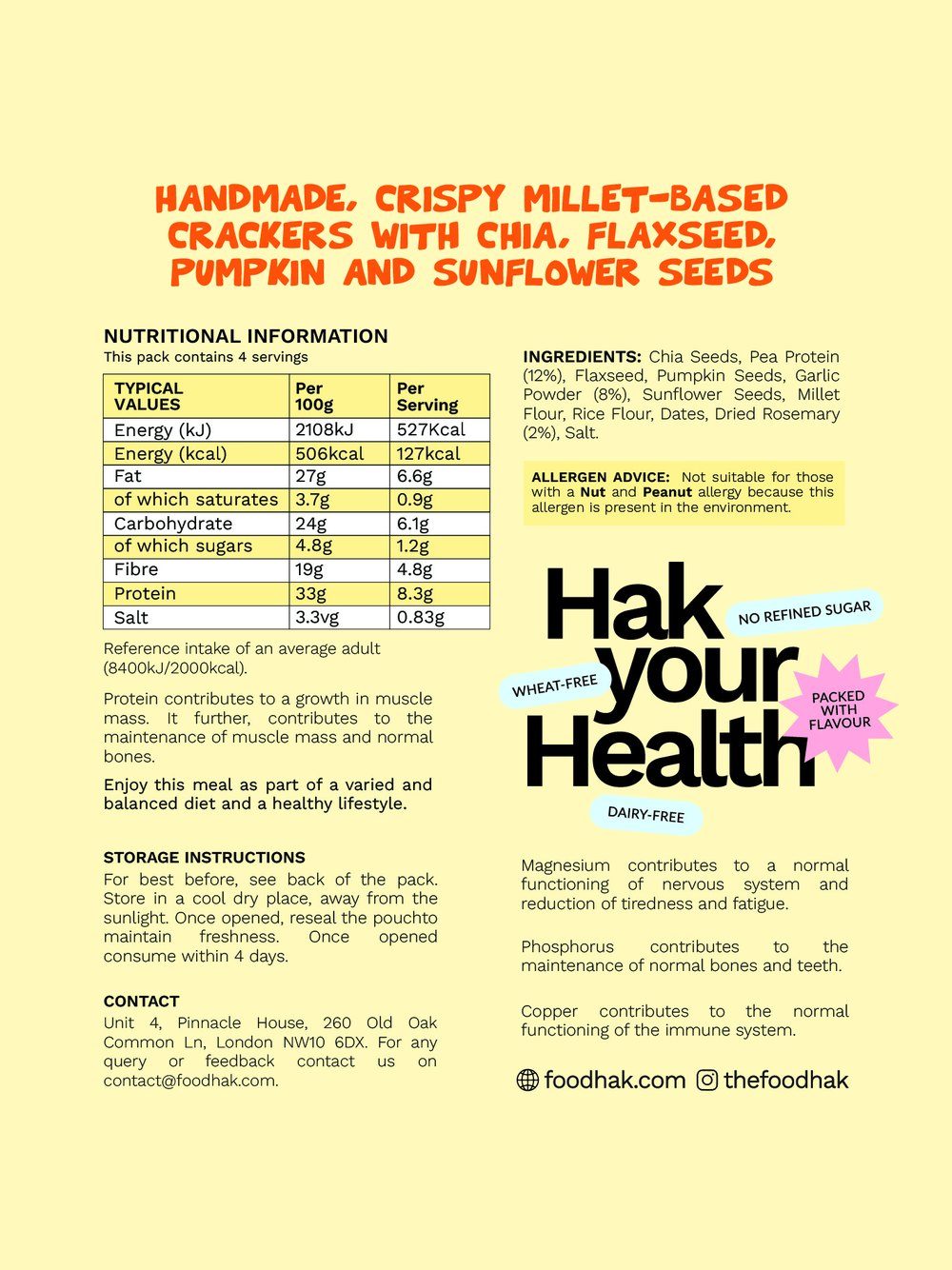
We experimented with a range of mediums, such as cylinder tins and boxes, before we settled on the pouch.
The pack: a stand-up pouch with a metallic finish
I chose a stand-up flexible pouch with a metallic finish. It was easy to use and lightweight, which suited a snack people carry and open.
The pouch has a resealable seal, so people can close it after opening. The metallic finish gives the pack a premium position, and it is used on the claims that matter most, such as 24g protein per pack and Check the ingredients.
Minis came later, in the same design at a smaller size, so the range could sit in more places, such as airports and rail.
Crafted from real crackers
Every detail on the pack was chosen on purpose.
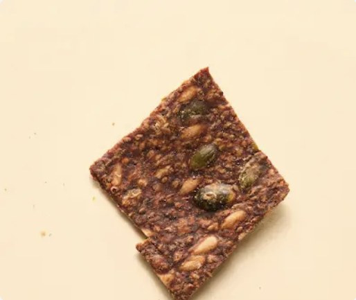
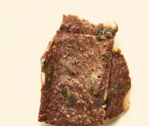
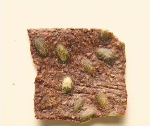
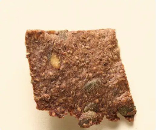
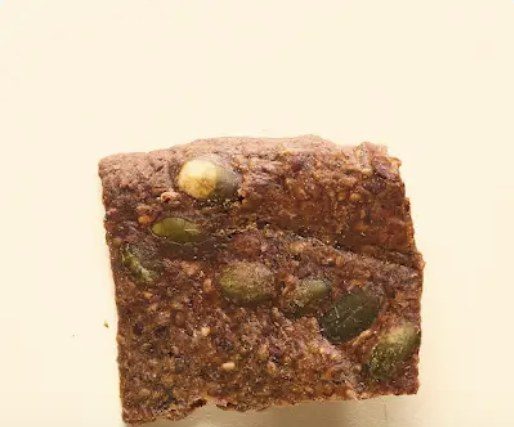
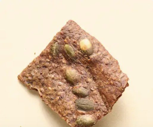
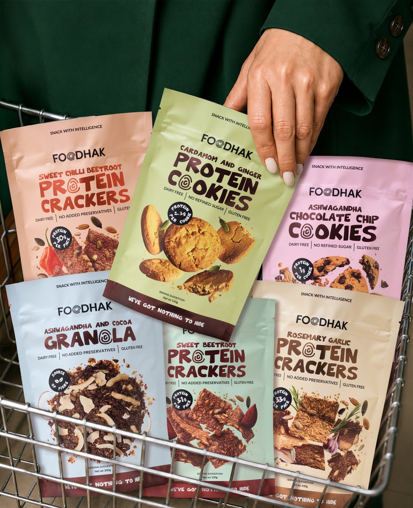
We carefully crafted the packaging using individually shot crackers and cookies. The pouches show the product clearly, so the shopper sees exactly what they are buying. For the flavours, we used ingredient images in a composition on the front.
The front: “We’ve got nothing to hide”
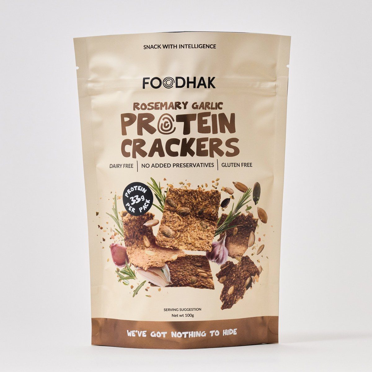
The clean ingredient label was the proof behind “Intelligent”. A short, natural list means there is nothing to explain away. So the front of the pack says it: We’ve got nothing to hide.
The packaging review asked for one recurring promise across every pack. This line is that promise, and it runs as a band across the bottom of every pack.
Protein is the hero
Protein is the hero, so the number is the first thing a shopper sees.
The front of the Rosemary Garlic pack shows 33g protein per pack, and the back repeats the claim, next to 19g fibre per pack and the nutrition panel.
The badges work across the whole range, from 1g protein per cookie to 33g per pack. The claim reads the same on every pack, even though the numbers change.
The font: handmade, like the snacks
The font looks handmade, because the snacks are handmade.
The headline type has the irregular edges of hand lettering. Handmade lettering suits a snack that is made from simple, natural ingredients, and it gives the pack the same warmth as the product inside.
The O in PROTEIN has three spirals, which echoes the spiral O in the Foodhak logo. The brand’s own mark sits inside the product name, so the two read as one system.
The back: The Foodhak formula
The back explains the Foodhak Intelligent Formula as a simple sum: nutritional science, forgotten superfoods, big flavours and only natural ingredients add up to the intelligent snacking choice.
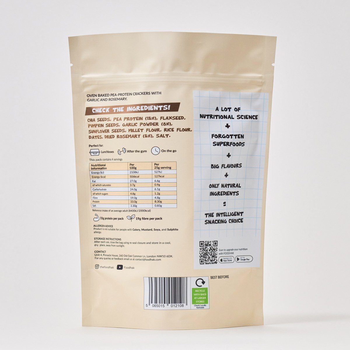
The back also says where the snack fits: lunchboxes, after the gym, or on the go. Each one is a moment when someone reaches for a snack, so the pack names them directly.
The ingredients are the other half of the idea. A “Check the ingredients!” label sits above the list, and the ingredients are in bold, so the clean label is the first thing a shopper reads.
The app has its own app panel, with a QR code and app store badges, so it stays separate from the food.
Where it went
The packs are stocked at H&B, Planet Organic, Ocado, Zapp, Amazon, WH Smith and 100+ independent stores across London.
What I'd carry forward
- Pick one promise, then build the pack around it. The clean label was true before anything was designed, which made the idea easy to believe.
- Lead with protein. The badge is what shoppers scan for, so the number leads, and the food supports it.